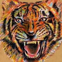
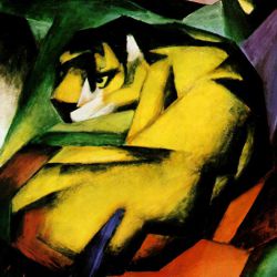
How to Draw a Tiger with Oil Pastels
This step by step art lesson demonstrates the technique used to create an oil pastel drawing of a tiger.
Our lesson on 'how to draw a tiger' is a step by step demonstration of the oil pastel technique used to create our tiger drawing.
Oil pastels, also called oil crayons, are an ideal medium for rendering this subject as the strokes of the pastels naturally suggest the texture of the tiger's face. A light brown sugar paper was chosen for this image but oil pastels work well on any color of paper. Oil pastels are a greasy medium that can be mixed on top of one another or blended into one another by smudging. They can also be thinned to a transparent glaze with turpentine and manipulated with a brush.
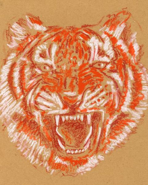
Drawing a Tiger: Step 1
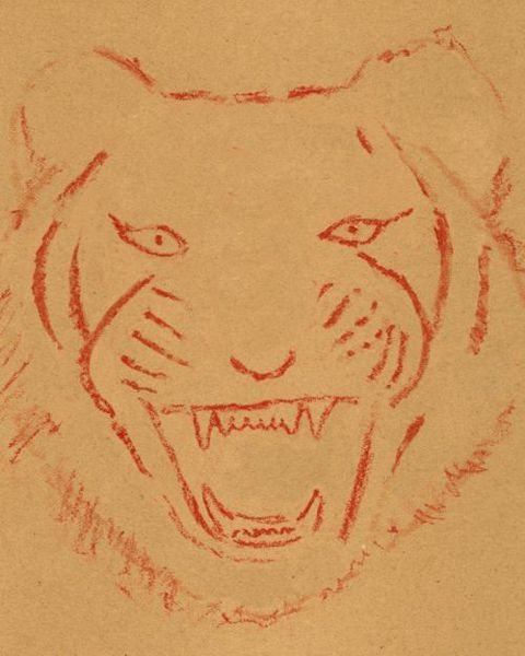
The first step in this drawing was to establish the basic proportions of the tiger's features - the position and relationship between the eyes, nose, mouth, cheeks and ears.
Note: It is important to start this drawing in colored lines because black lines would mix with, and destroy the purity of any colors that were applied over them. As black oil crayons contain very strong pigments, it is a good policy to limit their use to the final stages of a drawing. A reddish-brown crayon was chosen because it was not too bright and matched the general color of the subject.
Drawing a Tiger: Step 2
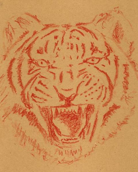
The second step in this drawing was to lay down the pattern of markings on the tiger's face. It is natural to establish the dark markings first as we are drawing with a dark color on a light background. The darker tones around the mouth were also applied at this stage to emphasise the teeth - an important expressive element in this drawing.
Note: You must adapt your drawing technique to suit the qualities of the oil pastels. You need to use bolder marks that reflect the natural character of the medium. You can make life very awkward if you try to adapt a broad medium like oil pastels to convey, for example, the fine details that you can achieve with a sharp pencil.
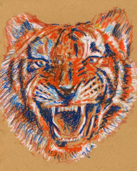
Drawing a Tiger: Step 3
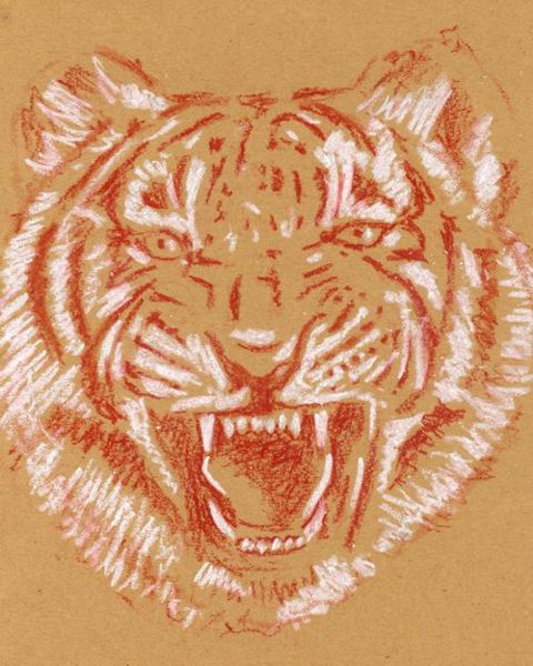
The third step in this drawing was to lay down the light markings on the tiger's face. White was used to produce the strongest possible contrasts in order to create the maximum dramatic effect. The expressive highlights on the eyes, tongue and teeth were also entered at this stage.
Note: You can use bright colors like white with greater safety and freedom than you can use dark colors because it is technically simpler to make changes to bright colors. Due to the blending properties of oil pastels, it is easier to darken a light color than it is to lighten a dark color.
Drawing a Tiger: Step 4
The fourth step in this drawing was to introduce color. Orange was applied first as it is one of the basic colors of the tiger and it also provided a suitable mid-tone. You can see that the color of the image is starting to build up but there is trade-off in definition and contrast.
Note: Difficulties emerge when you start to blend colors in an artwork because the blending of colors tends to lighten the dark tones and darken the light tones. The overall effect of this is that you start to lose the contrasts that give the work its impact. This is a common occurrence in many artworks. Therefore, it is important not become discouraged if you lose some definition or contrast at certain stages - it is part of the normal process in drawing and it can be restored later.
Drawing a Tiger: Step 5
The fifth step in this drawing was to restore the dark tones. As the image had become too orange, its opposite color blue was used to counter this effect. Blue interacted well with the other colors. When blended over the reddish-brown underdrawing, it restored the dark tones but was also useful in moderating the strength of the white.
Note:When you lose definition and contrast through blending colors, you need to restore them by readjusting the dark and light tones to their former levels. In doing this you can make your image more expressive by using different colors for the respective tones.
Drawing a Tiger: Step 6
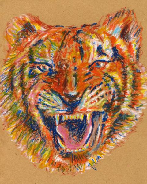
Yellow and pink were applied at this penultimate step. The yellow further moderated the light tones but it also added to the spectrum of colors across the image as it enriched some of the orange and turned some of the blues to green. Pink was used to suggest the flesh of the tongue but it was also lightly distributed in strokes around the drawing.
Note: Color is the element that sets the emotional tone of an artwork and, if applied vigorously, it can suggest the power and energy of the subject. This subject demands a forceful technique and oil pastels are ideally suited to the task.
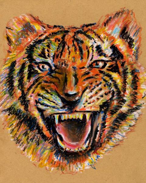
Drawing a Tiger: Step 7
The final step in our tiger drawing was to heighten the dramatic effect of the image by increasing the contrast in key areas. Black was used to strengthen the tiger's markings and focus our attention on its teeth and eyes - the most expressive features of this fearsome creature.
Note: Black should always be used economically and with care as it can easily ruin your work. It is the most dangerous of all the colors as it is the most difficult to fix if you make mistakes.