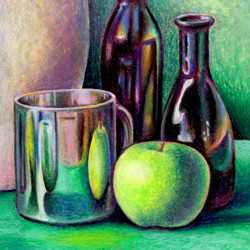
Still Life Techniques - Pastel Drawing
Teach yourself how to draw a naturalistic still life using chalk pastels on paper.
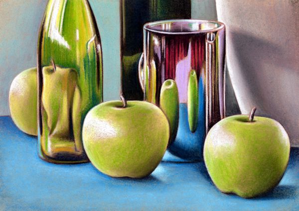
This step by step lesson will teach you the drawing techniques used to create a still life with chalk pastels and pencils on brown sugar paper.
-
Steps 1 to 4: These steps demonstrate how to establish the lines, shapes and tones of the still life.
-
Steps 5 to 9: These steps illustrate how to build up the colors of the still life.
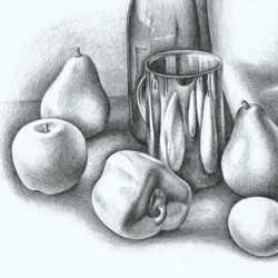
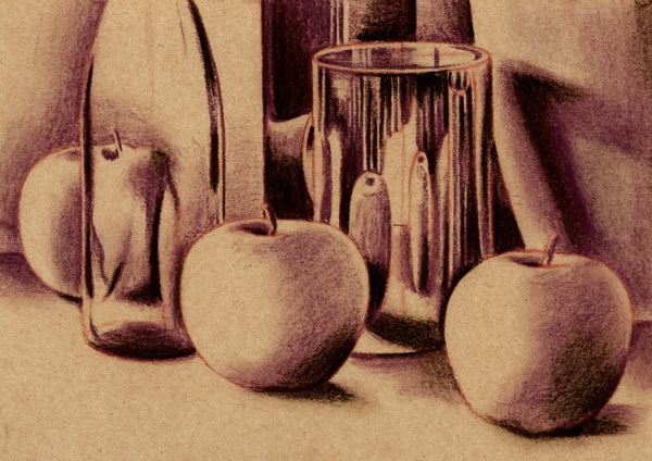
Step 1 - A preliminary line drawing
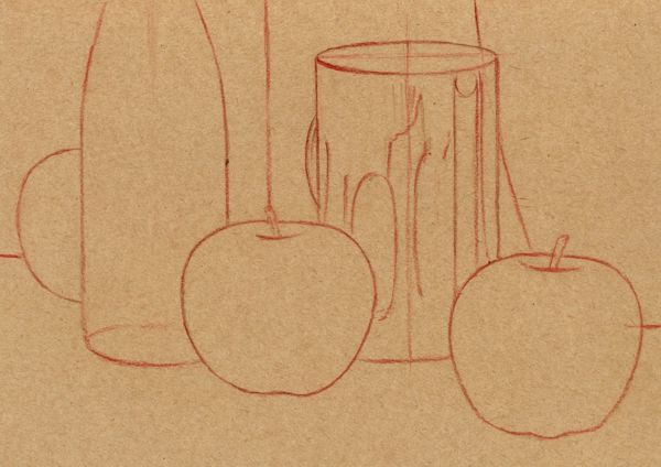
Our still life lesson using chalk pastels begins with a line drawing to establish the basic shapes of the group and some of the reflected details on the objects.
-
Fixative spray was applied at this stage to prevent the drawing from smudging.
-
NB: To see the stages that lead up to this point in the drawing please view our lesson on Still Life Lessons - Pencil Drawing).
-
When you are working with chalk pastels it is not good practice to start your drawing using a black pastel or charcoal pencil as it will contaminate the purity and freshness of any colors applied over it. In this case the initial sketch was done with a violet pastel pencil. After some tests it was found that most of the other colors in the box blended comfortably on top of this color.
Step 2 - Establishing the dark tones
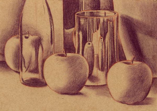
The next step in creating our still life in pastels was to focus purely on the dark tones, with a view to rendering the form of the objects, before applying color in the later stages of the work.
-
A violet crayon was used to establish the areas of dark tone which were then smudged and blended using both a tortillon and tissues. A similarly colored pastel pencil was used for the finer details.
-
Be careful not to overwork the dark tones as it is easier to darken pastels than it is to lighten them. Make sure you leave an adequate amount of unshaded paper to accommodate the lighter tones and colors. If you apply the dark tones too heavily at the start of a work you will have difficulty in keeping the lighter colors bright as the darker tones will persist when you blend them together.
Step 3 - Intensifying the dark tones
A burnt umber (very dark brown) pastel crayon and pencil were used to intensify the darkest sections of tone. Adding this deeper level of tone will enhance the form of the objects and increase the impact of the still life.
-
Once you establish the general areas of dark tone, it is necessary to look more closely at the objects to find the darkest sections that lie within their areas of shading.
Step 4 - Establishing the light tones
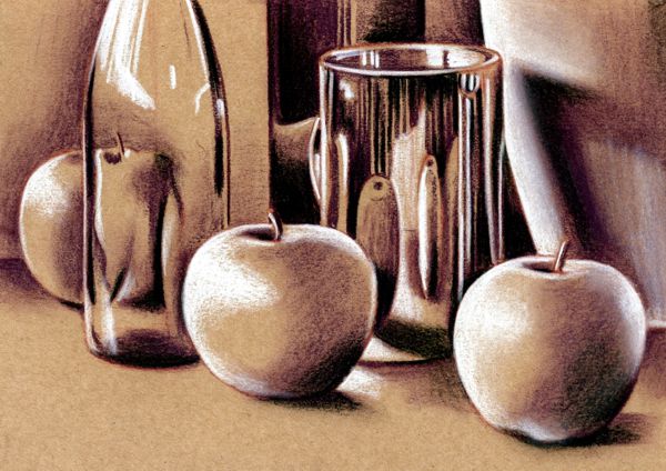
Next you establish the lightest areas of tone to heighten the three dimensional qualities of the still life.
-
The aim here is to create a balance between the light, dark and medium tones: the light tones rendered by the white chalk, the dark tones created by a blend of violet and burnt umber and the medium tones established by the neutral color of the paper.
-
It is very important that you do not overwork the light and dark tones and leave enough of the paper exposed to accept the layers of colors that are yet to be applied.
-
Fixative spray was applied at this stage to prevent the drawing from smudging.
-
A stick of white blackboard chalk was used to render the light tones. Blackboard chalk is harder than pastels and can be sharpened to a fine point to highlight the crisp edges and fine details of the objects.
Step 5 - Introducing color
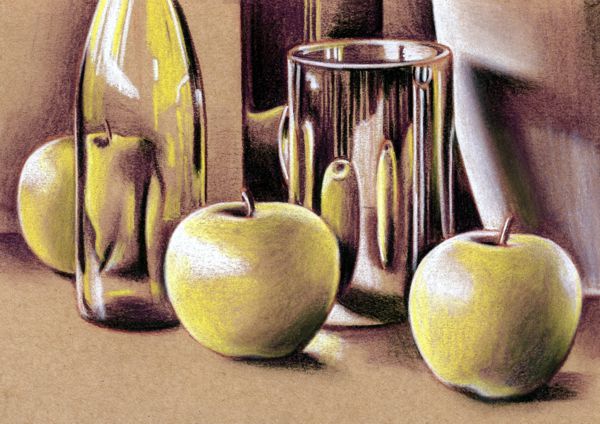
You now begin to introduce color to the still life in a series of layers, applying the brightest layer first, the next brightest second, and so on towards the darkest.
-
At this stage a layer of yellow was applied to the exposed areas of paper on those objects whose colors ranged between yellow and green.
-
Once you apply an area of color, gently soften its edges to subtly blend it into the light and dark tones.
Step 6 - Building up color: 1
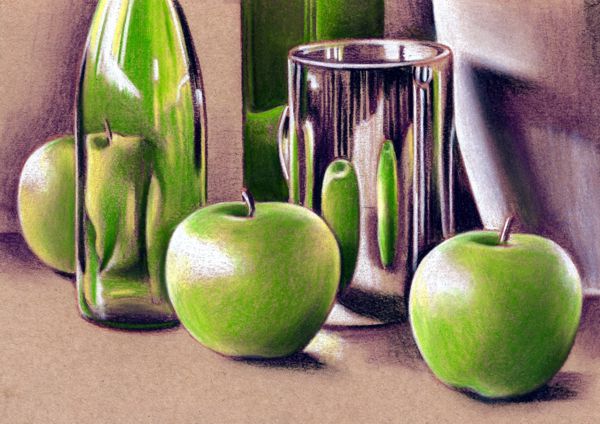
A layer of green was carefully blended into those objects which had a greenish hue.
-
Applying the green on top of the yellow gives the color a luminosity and complexity that you do not get from using a single color.
-
As you blend the various layers of colors over the light and dark tones of the objects, you will notice that those colors begin to take on the underlying tones of the object. The success of this technique largely depends on those colors that you choose for the dark tones at the start of the still life.
-
Always test your colors before you start the still life to see what range of tones they produce when mixed.
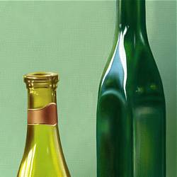
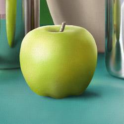
Step 7 - Building up color: 2

Next, a layer of light and mid blue were softly blended into the background and foreground respectively.
-
When the mid blue is blended over the underlying dark tones of the foreground, it does not achieve the same depth of tone as the dark green shadows did on the apples. This is because the blue is more opaque than the green. Such variations have to be adjusted and balanced out once all the colors have been applied.
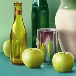
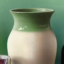
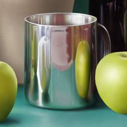
Step 8 - Building up color: 3
Finally, the bright reflected colors on the silver cup and the neutral grey of the large vase on the right were carefully blended to complete the basic colors of the still life.
-
As the color of the still life has been built up one object at a time you often get an inconsistency in the overall unity of the work. This is generally seen in variations of tonal contrast across the work, usually due to the different opacity of colors or lapses in your concentration and technique. Either way, this problem has to be addressed in the final stage of the work.
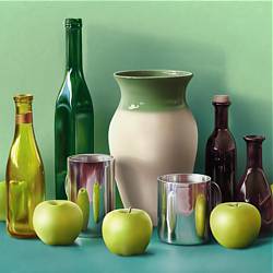
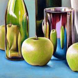
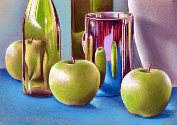
Step 9 - Balancing tone and color
To complete the still life we adjusted and balanced the tones and colors throughout the work to achieve an overall unity in the composition. This was done by subtly changing the color of certain objects and cautiously using black to balance the contrast of tones across the work.
-
The color black is used for the first time in this still life. The dangers of overusing black cannot be emphasized strongly enough. It must be used discreetly and with great care as it all too easily overpowers the other colors.