The Visual Elements - Color
Color is the visual element that has the strongest effect on our emotions. It is the element we use to create the mood or atmosphere of an artwork.
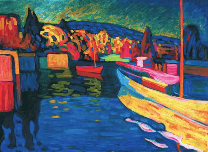
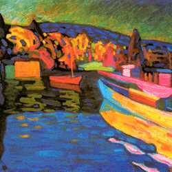
WASSILY KANDINSKY (1866-1944)
Autumn Landscape with Boats, 1908 (oil on board)
The Visual Element of Color has the strongest effect on our emotions. It is the element we use to create the mood or atmosphere of an artwork.
There are many different approaches to the use of color in art:
-
Color as light
-
Color as tone
-
Color as pattern
-
Color as form
-
Color as symbol
-
Color as movement
-
Color as harmony
-
Color as contrast
-
Color as mood
Our selection of artworks illustrated below have been chosen because they all use color in an inspirational manner. We have analyzed each of these to demonstrate how great artists use this visual element as a creative force in their work.
Color as Light
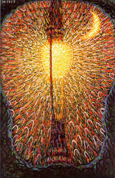
GIACOMO BALLA (1871-1958)
Street Light, 1909 (oil on canvas)
Color is the sensation that is stimulated in our brain by different wavelengths of light. One wavelength will stimulate our perception of red, another orange, another yellow and so on through all the colors of the spectrum.
'Street Light' by Giacomo Balla is a poetic impression that represents the physical properties of light. At its center, the bulb burns with a white heat in the darkness of the night. Its radiant glow dissolves in concentric waves, each of which diminish in intensity and change color to suggest the different wavelengths of the spectrum.
Balla was an Italian Futurist who revered the modernity of urban life. He painted 'Street Light' at the time when electric lighting was first introduced to the streets of Rome. It is a Futurist celebration of the power of technology as the symbol of the new age. The light even outshines nature herself as the corona of the crescent moon struggles to compete with its incandescence. The painting technique that Balla employed was derived from Pointillism, a more scientific approach to the analysis of color, and as such forms the perfect marriage between the subject and its execution.
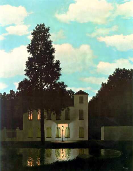
RENÉ MAGRITTE (1898-1967)
Empire of Light, 1954 (oil on canvas)
The 'Empire of Light' by René Magritte is an innocent image of suburban silence with a surrealistic twist: the scene is set at midnight but the sky is fixed at midday. This subversive image holds together a conflict of opposites within its unified structure: day meets night, dark meets light and reality meets the imagination. The convincing technique that he uses to paint the picture persuades the viewer to engage with the impossible search for a rational meaning, thereby drawing them into the irrational realm of the Surrealism.
Color as Tone
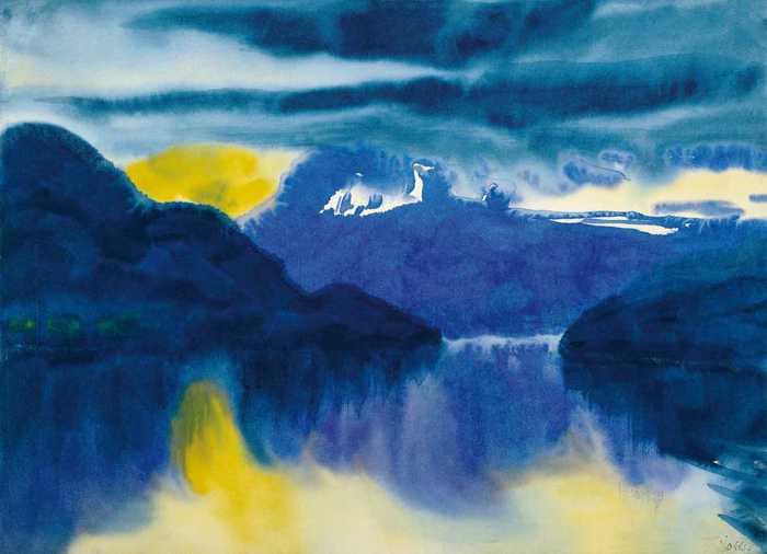
EMILE NOLDE (1867-1956)
Lake Lucerne, 1930 (watercolor on vellum)
Dramatic color combined with a vigorous painting technique are the key elements of Expressionism in art. Expressionist painting was more about using color and the physical qualities of a medium to express your feelings about the subject rather than simply describing it in a naturalistic fashion.
'Lake Lucerne' by Emile Nolde is a classic example of an expressionist painting technique. It is painted more from memory than from observation using the natural fluidity of watercolor to mirror the changing mood of the landscape. First Nolde soaks his paper, in this case vellum, with water. He then builds up the shapes of the mountains with washes in different tones of blue, more intense in the foreground becoming paler in the background. This creates an impression of aerial perspective as the tones of the colors appear to fade into the distant landscape. He continues using a 'wet on wet' technique to form the ephemeral layers of clouds and the watery reflections in the lake. Finally, he applies a spot of yellow which bleeds over the damp surface to create the glow of the setting sun which he then repeats on the lake to create its reflection.
Emile Nolde commented on his own watercolor technique, "I had always wanted to paint so that I, the painter, would be the medium through which the colors worked out their own logical development in the same way that nature creates her own work... I feel at times as though I myself can do nothing, but nature in and through me can do a great deal". [1]
Color As Pattern
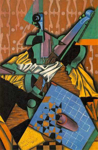
JUAN GRIS (1887-1927)
Violin and Checkerboard, 1913 (oil on canvas)
In Cubism the artist selects the essential features from multiple viewpoints of the subject and reconstructs them as an abstract composition. At the drawing stage of a cubist painting, the artist was often confronted with a confusing structure of lines and shapes to which he/she would apply patterns of color, tone and texture in an attempt to organize the spatial arrangement of the composition.
In 'Violin and Checkerboard' by Juan Gris, the artist assigns different colors to particular shapes which create an asymmetrical pattern of forms arranged around the white cloth at the center of the painting. This pattern of colors leads the viewer's eye in a clockwise motion around the picture. Color distributed as irregular pattern is often used as unifying element in the composition of artworks.
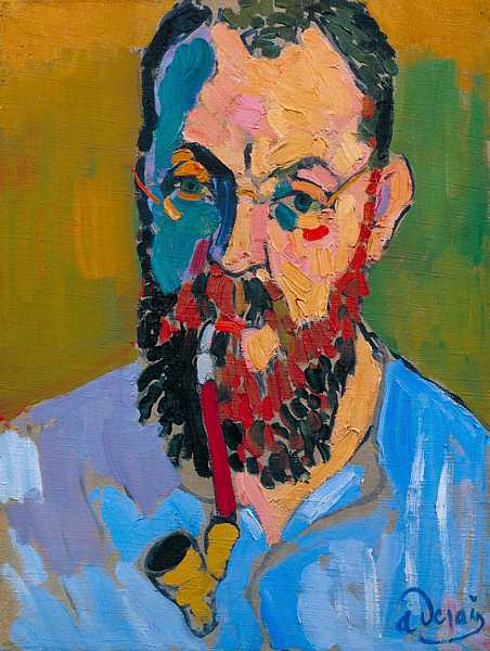
ANDRÉ DERAIN (1880-1954)
Portrait of Matisse, 1905 (oil on canvas)
To create the illusion of form in a painting, artists traditionally added lighter and darker pigments to the main color of an object in order to render the naturalistic effects of light and shade. The main disadvantage of this technique was that much of the intensity of the original color was sacrificed when it was blended with highlights and shadows. The Impressionists had introduced a more scientific approach to the analysis of color to try to solve this problem while some of the Post Impressionists had begun to use color structurally (Paul Cézanne and Georges Seurat) and symbolically (Gauguin and Van Gogh).
One group of artists who were bored with all the various naturalistic, structural and symbolic approaches to using color in painting were 'Les Fauves'. They simply wanted to use color that spoke to the spirit, celebrating its vitality and feel-good factor.
Fauvism was a style of painting developed at the start of the 20th century by Henri Matisse and André Derain. 'Les Fauves' valued intense color for its emotional impact more than for its ability to render form. They used colors at their highest pitch with a simplified drawing technique to express their feelings about their subjects.
In the painting above, André Derain demonstrates how the intensity of Fauvist color can be used to replace the traditional technique of rendering form with light and shade. First, Derain simplifies his drawing of Matisse into angular planes. Next, he selects colors which are sensitively balanced, paying some respect to their tonal values but pitched at their maximum intensity. Finally the colors are applied in slabs of expressive brushwork without any subtle blending. Color and form now coexist as equals in his painting, both expressing and describing this exhilarating 'Portrait of Matisse'.
Color as Harmony
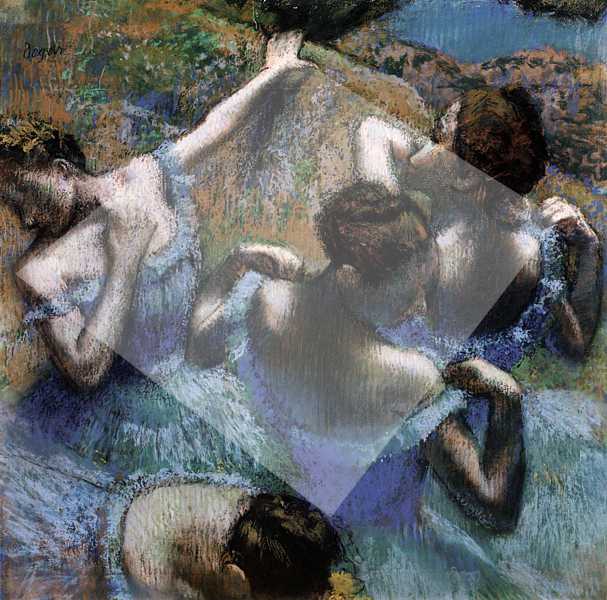
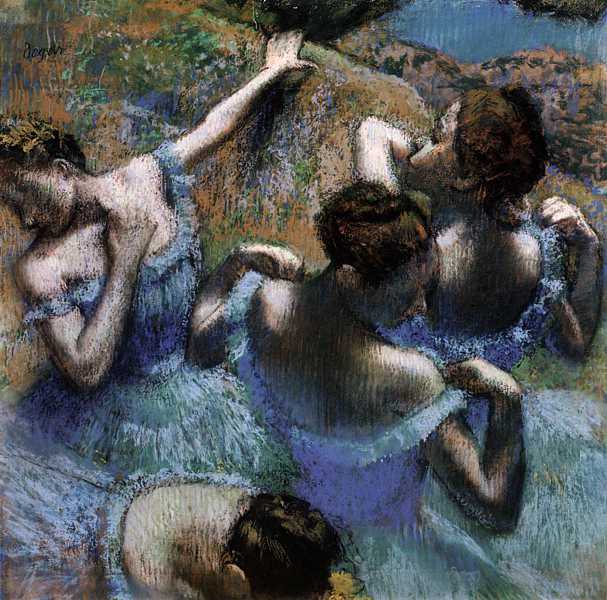
EDGAR DEGAS (1834-1917)
Blue Dancers, 1899 (pastels)
Harmony is the compatibility, balance or progression of similar elements. 'Blue Dancers' by Edgar Degas is a carefully composed pastel painting that illustrates the harmony of color as well as several other visual elements:
-
The shape of the painting is square while the rotational movement of the figures is composed within a diamond forming a harmony of rectangular shapes (click on flip icon to view).
-
The decorative frills around the bodices of the dresses form a subtle harmony of curves.
-
The pointed projections of arms, elbows and wrists create a rhythmic harmony of angles.
-
The warm ochres of the background should clash with the cool blue dresses in the foreground as they are opposite colors. However Degas reconciles their opposition with a clever harmony of their colors. He scumbles traces of blue over the warm ochre background which is counterbalanced by the ochre underpainting that beats beneath the blue dresses. This has the effect of harmonizing the foreground with the background but still retaining enough contrast to stimulate our interest.
Color as Contrast
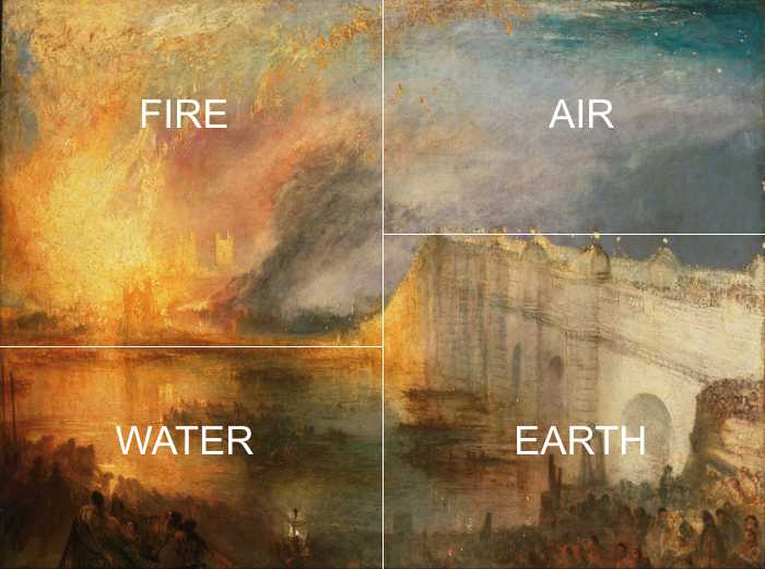
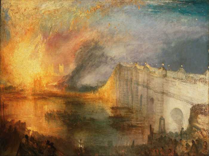
JOSEPH MALLORD WILLIAM TURNER (1775-1851)
The Burning of the Houses of Lords and Commons, 1835 (oil on canvas)
Few painters in the history of art capture the intensity of light and energy more than Joseph Mallord William Turner. In his first of two versions of 'The Burning of the Houses of Lords and Commons' (1835), the visual elements of the painting are fuelled by a collision of the classical elements of earth, air, fire and water.
Turner personally witnessed this event from among the thousands of people who lined the south bank of the River Thames as well as from a boat that he hired to get closer to the scene. He created a series of quick watercolor sketches of the fire but there is some dispute that they were painted at the location.
The composition of the work is divided into four sections, each of which harbors one of the four classical elements (click on the flip icon to view). On the left the blazing oranges and yellows of the burning buildings are set in opposition to the cold blues and lilacs of the sky. The hot colors of the flames and their reflections (fire and water) are intensified by the cold colors of the sky and bridge (earth and air). A similar tension is established by the tonal contrast of the dark crowd against the light river which is counterbalanced by the light sandstone of Westminster Bridge against the darkening sky. This painting is a cleverly arranged contrast of opposite colors, tones and classical elements which Turner has devised to heighten the impact of each.
Color as Movement
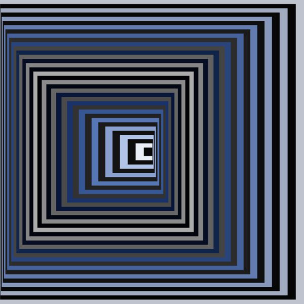
VICTOR VASARELY (1906-1997)
Vonal KSZ, 1968 (silkscreen print)
When you look at an abstract artwork your brain instinctively searches for signs of rhythm and order to try to make spatial sense of the image. Victor Vasarely makes use of this impulse to create an impression of movement by combining graduated squares and sequential colors. These lead the eye into and through the image with increasing and decreasing acceleration. The squares, which graduate from large to small, are aligned on their horizontal axes but are staggered on their vertical axes to create the illusion of a tunnel whose dizzying perspective unfolds as they travel towards the vanishing point at its center.
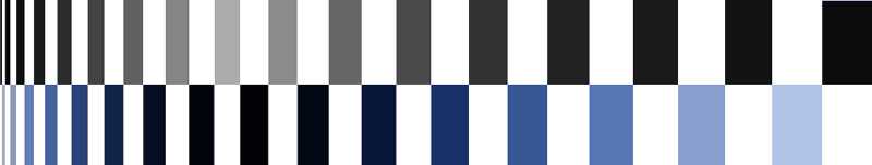
Separation of Color Progressions in Vonal KSZ, 1968 (silkscreen print
The receding squares in this image form the shape of the movement while the progression of colors determine its speed. In our illustration above we have separated the alternate sequences of colors so that you can see their relationship more clearly. You can now distinguish their tonal scale as one sequence moves from dark through light to dark, while the other moves from light through dark to light. The changing contrasts of these sequences form a counterchange of tones and colours which give rise to the retinal roller coaster ride that is 'Vonal KSZ'.
Color as Symbol
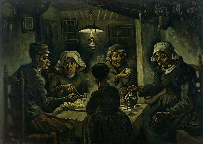
VINCENT VAN GOGH (1853-1890)
The Potato Eaters, 1885 (oil on canvas)
The Potato Eaters by Vincent Van Gogh is his masterpiece from the first period of his work before he moved to Paris in 1886. It portrays a poor Dutch peasant family sitting down to share their frugal evening meal. They are agricultural labourers and the earthy greens and browns that Van Gogh uses to paint them symbolize their closeness to and dependence on the land for their survival. There is a unity of colour and texture between the hands and faces of the peasants and the potatoes and coffee they are sharing. The dark sombre tones of the work sympathetically reflect their humble existence and the artist's respect for the quiet dignity of their labour.
You can find out more about the symbolic associations of color on our color theory pages.
Color as Mood - Joy
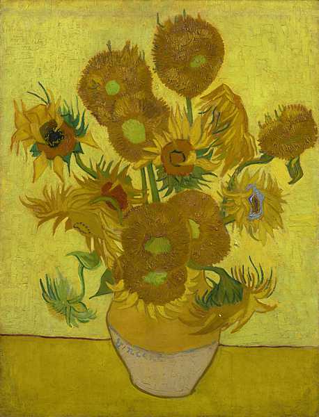
VINCENT VAN GOGH (1853-1890)
Sunflowers, 1888 (oil on canvas)
For Van Gogh, yellow was the colour of joy and friendship. He painted a series of at least seven sunflower pictures to decorate the rooms of his 'Yellow House'. These paintings were conceived as a welcome to his friend and fellow painter Paul Gauguin with whom he dreamed of setting up a ‘Studio of the South’ [2] in Arles in the South of France.
In contrast with the sombre mood of 'The Potato Eaters', 'Sunflowers' is one of the most joyful paintings in the history of art. Despite the fact that it has echoes of the Vanitas subjects of 17th century Dutch still lifes, as some of its blooms have turned to dead seed heads, it still glows with a radiance that transcends any hint of melancholy.
The composition of the work is simplicity itself: fifteen sunflowers sit in a vase on a table; they are arranged symmetrically and fill the canvas; the vase, flowers, table and background are predominately yellow and cast no shadows. It is this absence of complication in both the drawing and arrangement of the work that liberates its color to communicate with a greater intensity than you would expect. 'Sunflowers' radiates colour rather than using it as a descriptive element.
This is a key image in the development of modern painting and the foundations of both Fauvism and Expressionism lie within its radical concept. Van Gogh had revolutionary theories about colour. He released it from its descriptive roll in imitating nature and empowered it to express his emotions: ‘Because instead of trying to reproduce exactly what I see before my eyes, I use colour more arbitrarily to express myself forcefully.’ [3]
Color as Mood - Sadness
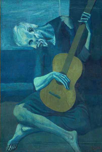
PABLO PICASSO (1881-1973)
The Old Guitarist, 1903-04 (oil on panel)
We often use the language of color to describe our emotions. We talk of being 'red' with rage or 'green' with envy. If we are feeling good we are in the 'pink' or if we are sad we've got the 'blues'. When Pablo Picasso painted 'The Old Guitarist' he was certainly suffering from the 'blues'. In fact, the main body of his work between 1901-04 is now referred to as his 'Blue Period'.
In 1901 Picasso sank into a deep depression after the suicide of his close friend Carlos Casagemas. His subsequent work reflected his sad psychological state in both its subject matter and the colors he used to paint it. One symptom of his depression was that he entered a period of self imposed social exile. As a consequence of this he identified himself with those whom society had exiled - the poor, the lonely, the infirm, the destitute vagrants and vagabonds of street - and they became the subjects of his work. He would paint these sorrowful figures mostly in tones of blue to enhance their melancholic mood.
'The Old Guitarist' is a major work that illustrates the key elements of Picasso's 'Blue Period'. There is a strong focus on the humanity of the old man whose emaciated and twisted physique not only expresses the anguish of his abject condition but also the tormented emotions of the artist himself. This is a timeless image whose style unites past and present. It owes as much to the tortured mannerism of the 16th century artist El Greco as it does to the contemporary introspection of Expressionism. Picasso's use of blue as the corresponding color of sadness is counteracted by the comforting shade of the brown guitar. Its soulful tone is the only note of consolation in this tragic image.
Color as Mood - Peace
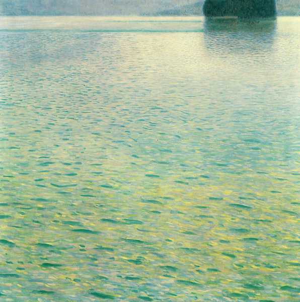
GUSTAV KLIMT (1862-1918)
Isle on Lake Attersee, 1902 (oil on canvas)
Gustav Klimt is known for his paintings of sensual allegories and society portraits of beautiful women, all dripping with opulent ornamentation in a fusion of figuration and abstraction. He was always a workaholic and is idea of a taking a peaceful holiday was to paint a different subject, in a different style, in a different place. For around sixteen years (1900-1916) he visited the Salzkammergut, a picturesque region of alpine lakes, forests and mountains where he painted landscapes as a form of relaxation. These works were almost always square shaped as he used the same small ivory viewfinder to frame the landscape. Consequently the composition of these paintings was flat and patterned as he would 'crop' the image around or below the horizon, thereby negating the effect of perspective. This allowed him to focus on the abstract relationships of the colors, shapes, patterns and textures of the woods and the lakeside.
The 'Isle on Lake Attersee' has many of the characteristics of Klimt's summer landscapes. The isle and its horizon are at the top of the picture acting like a hinge that swings your attention down to the reflective surface of the lake. There are few more peaceful pursuits than to sit at a lakeside and watch the glimmer of light and color on the surface of the water. Klimt conveys that peaceful feeling of total relaxation and contentment in the way he focuses his attention on the Impressionistic spectrum of turquoise and blue reflections that gently merge into the soft waves of yellow sunlight.
Color as Mood - Anxiety
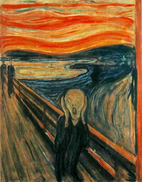
EDVARD MUNCH (1863-1944)
The Scream, 1893 (oil, tempera and pastel on cardboard)
The Scream' by Edvard Munch has entered the public consciousness as an emblem of anxiety. All its elements combine to form an image of impending doom, a panic attack in color and shape. The two main colors of the painting are orange and blue, a lurid contrast from opposite ends of the spectrum, guaranteed to form a tense relationship. An anxious state of agoraphobia is generated by the extended perspective of the bridge and the haunting waves of sound that echo around the fjord. A stomach churning glimpse over the edge of the handrail initiates an attack of vertigo. A deep sense of isolation and helplessness is experienced by the figure who is holding his head to absorb the phobic assault from this environment, while his path of escape is blocked by the spectral figures at one end of the bridge and the mysterious border that channels the burning color of the sky at the other.
The figure is Munch himself. In his diary of 1892 he wrote, "I was walking along the road with two friends. The sun set. I felt a tinge of melancholy. Suddenly the sky became a bloody red. I stopped, leaned against the railing, dead tired. And I looked at the flaming clouds that hung like blood and a sword over the blue-black fjord and city. My friends walked on. I stood there, trembling with fright. And I felt a loud, unending scream piercing nature."
Color as Mood - Noise
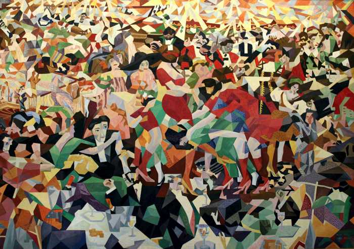
GINO SEVERINI (1883-1966)
The Dance of the Pan-Pan at the Monico, 1909-1911/1959-1960 (240cm x 400cm, oil on canvas)
We began this analysis of color in art with one Futurist painting and we end it with another. 'The Dance of the Pan-Pan at the Monico' by Gino Severini was the large centerpiece to the first Futurist Exhibition outside Italy at Galerie Bernheim-Jeune in Paris. It was painted in 1909-11, but this version was destroyed and Severini repainted it from a postcard in 1959-60.
The Futurists embraced the noise, energy and intensity of modern city life. The raucous night-life of the cabaret with its vibrant fashions and risqué dancing to ragtime rhythms, all illuminated by modern electric lighting, was the perfect setting for a vision of Futurist fun. Severini smashes this image into countless fragments which he reassembles in a dynamic composition that captures the collective consciousness of Futurism. Contrasts of opposite colors collide in a shatterproof structure that frames the fun, frolics, noise and excitement of modern entertainment.