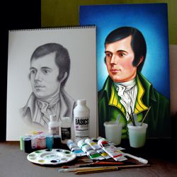
Acrylic Portraits - Starting a Portrait
This lesson starts with the preparatory drawing for our acrylic portrait and how to transfer it onto canvas, followed by the first steps in the painting.
Starting a Portrait
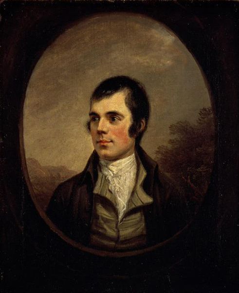
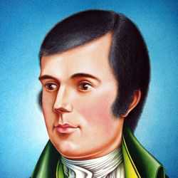
Alexander Nasmyth (1758-1840)
Robert Burns (oil on canvas, 1787)
Like many portraits, our acrylic painting of Robert Burns was the result of a commission. On agreeing to a commission it is very important for the artist to discuss and consider the client's ideas about the work in order to ensure that your approach to the subject is acceptable to them. In this particular case, the only limitations imposed by the client was that the portrait should be '16 x 24' inches and based on the 18th century oil painting by Alexander Nasmyth. As there are so few first hand likenesses of Burns in existence, it was also suggested that a description of the poet by the young Sir Walter Scott be used to inspire the image: ".....the eye alone, I think, indicated the poetical character and temperament. It was large, and of a dark cast, and literally glowed when he spoke with feeling or interest. I never saw such another eye in a human head, though I have seen the most distinguished men of my time."
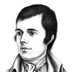
The Preparatory Drawing
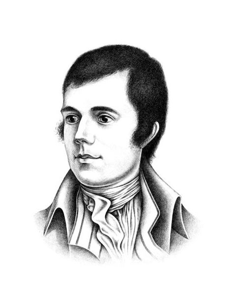
Pencil Portrait of Robert Burns
Whether you are working from life, photographs, or in this case another painting, it is necessary to create a preparatory drawing of the subject. This drawing is done to help you to resolve some of the difficulties that lie ahead:
-
A preparatory drawing should address any problems that you envisage in creating the image, e.g. the correct balance of proportion, tone and detail that give you the likeness you desire.
-
A preparatory drawing should be the same scale as the painting so that it can be used to trace and transfer the final image onto the canvas.
-
Our lesson on pencil portraits should help you with your preparatory drawing.
Transferring the Drawing to Canvas
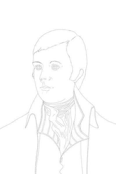
Start the portrait with a line drawing on the canvas.
A stretched canvas prepared with several coats of acrylic gesso, each sanded smooth before the application of the next, provides the ideal surface for our painting. Our line drawing was then 'traced and transferred' from our preparatory drawing onto the canvas ready to start the painting.
'Trace and transfer' technique: Take a tracing of your preparatory drawing in line. Then draw carefully over the back of your tracing paper so that you have the same image pencilled on both sides. Now place your tracing onto the canvas and draw heavily over the lines to transfer the image. Use a soft grade pencil (grade B or 2B) as this will transfer more easily.
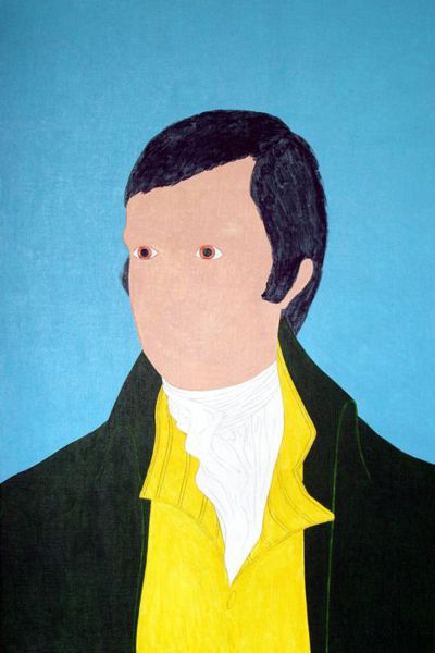
Underpaint each area of the portrait with flat color.
The first task in painting our portrait is to complete the underpainting of each area of colour in the picture. This is the local colour applied to individual sections of the portrait: e.g. the flesh, hair, jacket etc.
The underpainting is built up in thin flat layers of colour mixed with equal amounts of gloss and matte medium which gives the overall paint surface a neutral sheen. One of the advantages of painting thinly is that you may still be able to see some of your drawing beneath the surface. This often depends on the natural opacity of the colours you choose. However, if you lose some of your image, don't worry as you still have your preparatory drawing to refer to. It is in the nature of most painting to regularly lose and re-establish areas of the work.
The basic acrylic colours used for the underpainting of our portrait were:
-
a mixture of phthalocyanine blue and titanium white for the background.
-
permanent sap green for the jacket.
-
yellow medium azo for the waistcoat.
-
titanium white for the white of the shirt and eyeballs.
-
burnt sienna for the irises of the eyes.
-
a mixture of ivory black and Prussian blue for the hair and the pupils of the eyes.
-
a mixture of unbleached titanium, burnt sienna and scarlet red for the flesh.
Painting the Background
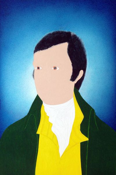
Use graduated tones for the background.
The underpainting of the background was done with several thin layers of an opaque light blue whereas the overpainting of the tone was built up from darker glazes of pure colours: Prussian Blue, Ultramarine and Cobalt Blue. Several blues were used to give the monochrome background an added depth of colour. A small amount of Titanium White paint is carefully blended around the edge of the head to increase its contrast with the background.
NB. The background should be painted over the outline of the portrait so that no gaps remain once the figure is completed.
We have used a graduated blue tone for the background for several reasons:
- blue is a colour that naturally recedes into the background.
- its strong tonal contrast dramatically illuminates the figure.
- the graduated tone suggests a depth to the background that extends beyond the perimeter of the portrait.
- blue is also the national colour of Scotland, the home of Robert Burns.
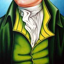
Background Painting Technique
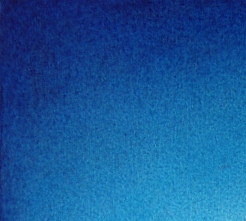
An actual size detail of the background painting.
Technically, the background was probably the most time consuming part of the picture to paint. We attempted a gradual transition of light to dark tones which could have been applied more evenly with an airbrush, but we wanted the consistent texture of the hand painted marks to unify the technique across the picture. The graduated effect was achieved by using small sable brushes and carefully stippling layers of transparent dark blue glazes over the light blue underpainting.