Pop Art
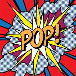
Pop Art was a style of modern art in the 1960's that used the imagery of mass-media, mass-production and mass-culture.
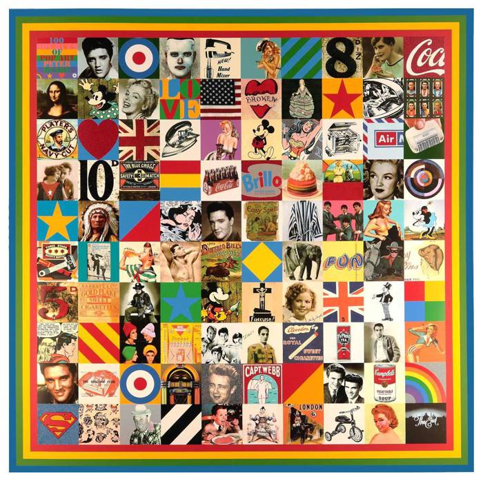
SIR PETER BLAKE (1932-)
'100 Sources of Pop Art', 2014 (silkscreen print with diamond dust, glitter and glazes)
Pop Art was the art of popular culture. It was the visual art movement that characterized a sense of optimism during the post war consumer boom of the 1950's and 1960's. It coincided with the globalization of pop music and youth culture, personified by Elvis and the Beatles. Pop Art was brash, young and fun and hostile to the artistic establishment. It included different styles of painting and sculpture from various countries, but what they all had in common was an interest in mass-media, mass-production and mass-culture.
British Pop Art
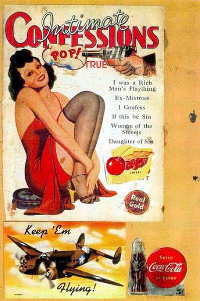
EDUARDO PAOLOZZI (1924- 2005)
'I was a Rich Man's Plaything' , 1947 (collage)
The word 'POP' was first coined in 1954, by the British art critic Lawrence Alloway, to describe a new type of art that was inspired by the imagery of popular culture. Alloway, alongside the artists Richard Hamilton and Eduardo Paolozzi, was among the founding members of the Independent Group, a collective of artists, architects, and writers who explored radical approaches to contemporary visual culture during their meetings at ICA in London between 1952 and 1955. They became the forerunners to British Pop art. At their first meeting Paolozzi gave a visual lecture entitled 'Bunk' (short for 'bunkum' meaning nonsense) which took an ironic look at the all-American lifestyle. This was illustrated by a series of collages created from American magazines that he received from GI's still resident in Paris in the late 1940s. 'I was a Rich Man's Plaything', one of the 'Bunk' series, was the first visual artwork to include the word 'POP'.
Some young British artists in the 1950’s, who grew up with the wartime austerity of ration books and utility design, viewed the seductive imagery of American popular culture and its consumerist lifestyle with a romantic sense of irony and a little bit of envy. They saw America as being the land of the free - free from the crippling conventions of a class ridden establishment that could suffocate the culture they envisaged: a more inclusive, youthful culture that embraced the social influence of mass media and mass production. Pop Art became their mode of expression in this search for change and its language was adapted from Dada collages and assemblages. The Dadaists had created irrational combinations of random images to provoke a reaction from the establishment of their day. British Pop artists adopted a similar visual technique but focused their attention on the mass imagery of popular culture which they waved as a challenge in the face of the establishment.
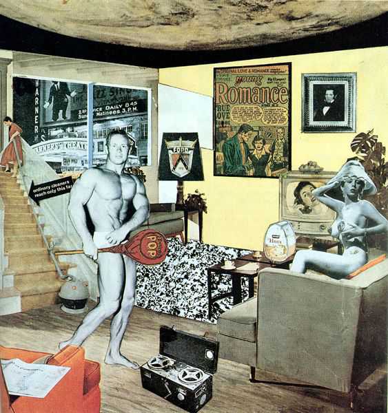
Richard Hamilton’s collage of 1956, ‘Just What Is It That Makes Today’s Homes So Different, So Appealing?’ is the ultimate catalogue of pop art imagery: comics, newspapers, advertising, cars, food, packaging, appliances, celebrity, sex, the space age, television and the movies. A black and white version of this collage was used as the cover for the catalogue of the 'This Is Tomorrow' exhibition at the Whitechapel Gallery in 1956. This show heralded a widening of our understanding of what culture is and inspired a new generation of young British artists that included Eduardo Paolozzi, Peter Blake, David Hockney, Allen Jones, Joe Tilson, Derek Boshier, Richard Smith and R.B Kitaj.
American Pop Art
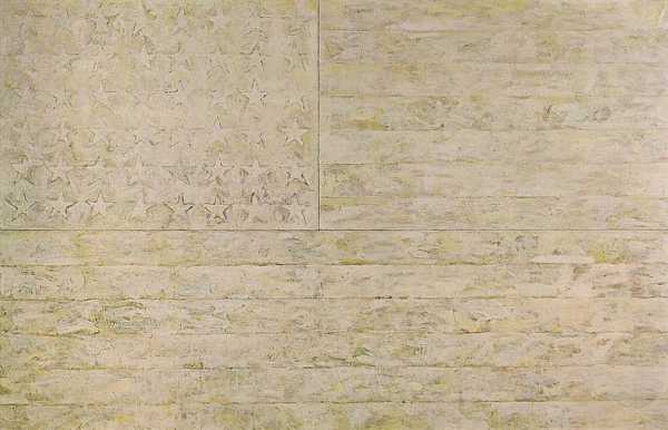
JASPER JOHNS (1930-)
'White Flag', 1955 (encaustic, oil, newspaper, charcoal on canvas)
Pop art in America evolved in a slightly differently way to its British counterpart. American Pop Art was both a development of and a reaction against Abstract Expressionist painting. Abstract Expressionism was the first American art movement to achieve global acclaim but, by the mid-1950's, many felt it had become too introspective and elitist. American Pop Art evolved as an attempt to reverse this trend by reintroducing the image as a structural device in painting, to pull art back from the obscurity of abstraction into the real world again. This was a model that had been tried and tested before. Picasso had done something similar forty years previously when he collaged 'real world' printed images onto his still lifes, as he feared that his painting was becoming too abstract. Around 1955, two remarkable artists emerged who would lay the foundations of a bridge between Abstract Expressionism and Pop Art. They were Jasper Johns and Robert Rauschenberg, the forerunners of American Pop Art.
Jasper Johns - The Found Image
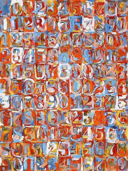
JASPER JOHNS (1930-)
'Numbers in Color', 1958-59 (encaustic and newspaper on canvas)
Jasper Johns' early artworks question how we look at, perceive and make art. He does not distinguish between subject and object in his work, or art and life for that matter. In his eyes they are both the same thing. Johns believes that we should not look upon a painting as a representation or illusion but as an object with its own reality.
Like the forerunners of British Pop Art, Johns was influenced by Dada ideas, in particular the 'readymades' (found objects) of Marcel Duchamp, whose bottle racks and bicycle wheels challenged the definition of the art object.
However, it was not 'found objects' that Johns introduced as a subject for his paintings, but ‘found images’ - flags, targets, letters and numbers - and it was this iconography of familiar signs that appealed to Pop. He saw them as "pre-formed, conventional, depersonalised, factual, exterior elements."
Johns' depersonalized images provided an antidote to the obscure personal abstraction of late Abstract Expressionism. His use of such neutral icons offered him a subject that was immediately recognisable but so ordinary that it left him free to work on other levels. His subjects provided him with a structure upon which he could explore the visual and physical qualities of his medium. The results were a careful balance between representation and abstraction.
Johns painted in encaustic, an archaic medium that dates from the first century which fuses pigment in hot wax. He combined encaustic with newspaper collage to create a seductive expanse of paint where his sensitive mark-making articulates the surface of the work. His fascination with the overall unity of the surface plane in a picture places him in a tradition that stretches back through Cubism and Cézanne to Chardin.
Johns' art plays with visual ideas that have layers of meaning and communicate on various levels. It is both sensual and cerebral - an art about art and the way we relate to it.
Robert Rauschenberg - Collage and Multi-Media
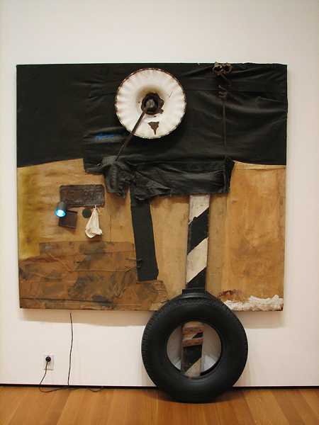
ROBERT RAUSCHENBERG (1925- 2008)
'First Landing Jump', 1961 (mixed media)
Robert Rauschenberg also used 'found images' in his art but, unlike Johns' images, they are combined in a relationship with one another or with real objects. The work of both these artists is often referred to as Neo-Dada as it draws on ‘found elements’, first explored by Dadaists such as Marcel Duchamp and Kurt Schwitters.
Inspired by Schwitters who created collages from the refuse he picked up on the street, Rauschenberg combined real objects that he found in his New York neighborhood with collage and painting techniques. He said, “I actually had a house rule. If I walked completely round the block and didn't have enough to work with, I could take one other block and walk around it in any direction – but that was it.” He called these multi-media assemblages ‘combines’, which “had to look at least as interesting as anything that was going on outside the window”. Rauschenberg believed that “painting is more like the real world if it's made out the real world”.
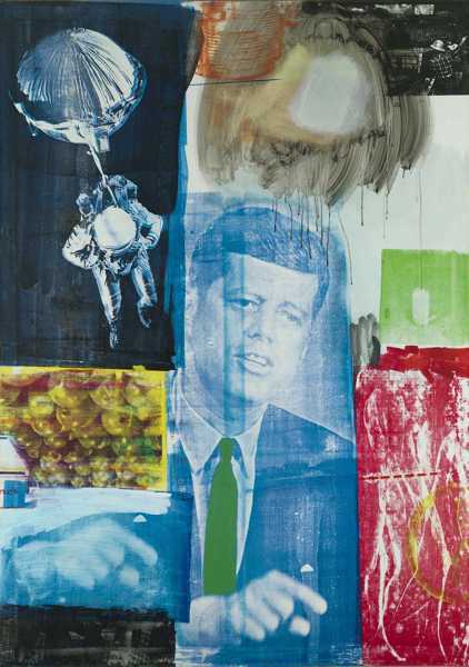
ROBERT RAUSCHENBERG (1925- 2008)
'Retroactive 1', 1964 (oil and silkscreen on canvas)
Collage was Rauschenberg’s natural language and he added to its vocabulary by developing a method of combining oil painting with photographic silkscreen. This allowed him to experiment with contemporary images gathered from newspapers, magazines, television and film which he could reproduce in any size and color as a compositional element on a canvas or print. He used these elements in a way that mirrors our experience of mass-media. Everyday we are bombarded with images from television, newspapers and magazines, disregarding most but retaining a few that relate, either consciously or subconsciously, to our individual experience and understanding. Rauschenberg's paintings capture this visual 'noise' in a framework of images whose narratives suggest some kind of ironic allegory.
Rauschenberg was interested in our changing perception and interpretation of images: "I'm sure we don't read old paintings the way they were intended." In 'Retroactive 1', Rauschenberg plays with the way we have read paintings since the early Renaissance. The composition recalls early religious icons where the central figure of Christ or a saint would have been surrounded by some smaller narrative panels. An iconic image of the venerated President Kennedy, the most powerful man in the world who was assassinated in the previous year, holds the central position as he forcefully issues a warning. He points to the red image on his right which looks deceptively like Masaccio's 'Expulsion of Adam and Eve from the Garden of Eden' (c.1432) from the Brancacci Chapel in Florence. With the symbolic association of 'red' and the mushroom-shaped cloud hovering above the president's head, this could easily be interpreted as a cold war reference to the Cuban Missile Crisis, ironically using a creation allegory to represent the Doomsday scenario. However, Rauschenberg is not that simple. If you look more closely you discover that the red image is not a section of Masaccio's fresco, but a stroboscopic flash photograph (Life Magazine, 10/10/1952 by Gjon Mili) of a real life reconstruction of the painting 'Nude Descending a Staircase, No 2' (1912) by Rauschenberg's mentor Marcel Duchamp.
While a single apple is a metaphor for Original Sin in Renaissance paintings of Adam and Eve, in 'Retroactive 1' an astronaut parachutes back to earth only to land in an upturned box of the 'forbidden fruit' - a symbol of how man's potential for evil has multiplied in the modern world (in Latin, the words for 'apple' and 'evil' are identical in their plural form: 'mala'). Rauschenberg extends his metaphor by illustrating in the top right of the painting what the astronaut is returning to: Eden after the Fall - a world polluted by industrialisation. 'Retroactive 1' is a very appropriate title for the work as it relates to a canon of images, events and ideas across time.
Andy Warhol - from Soup Cans to Celebrities
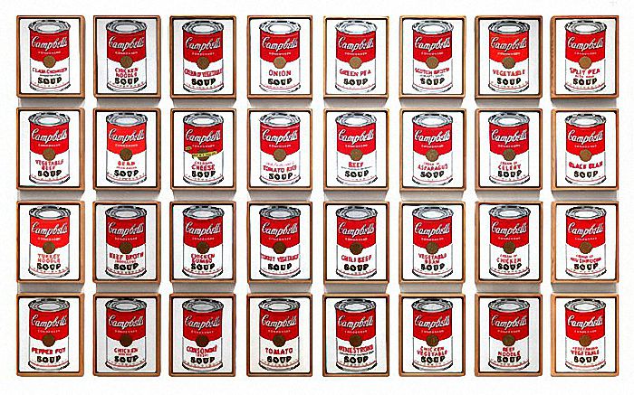
ANDY WARHOL (1928-1987)
‘32 Campbell's Soup Cans’, 1962 ( synthetic polymer paint on canvas)
If there was one artist who personified Pop Art it was Andy Warhol. He originally worked as a 'commercial artist' and his subject matter was derived from the imagery of mass-culture: advertising, comics, newspapers, TV and the movies.
Warhol embodied the spirit of American popular culture and elevated its imagery to the status of museum art. He used second-hand images of celebrities and consumer products which he believed had an intrinsic banality that made them more interesting. He felt that they had been stripped of their meaning and emotional presence through their mass-exposure. Typically subverting the values of the art establishment, Warhol was fascinated by this banality which he celebrated in a series of subjects ranging from soup cans to celebrities. Whether it was a painting of 'Campbell's Chicken Noodle' or a 'Car Crash', a portrait of 'Elizabeth Taylor' or the 'Electric Chair', Warhol's detached approach was always the same: "I think every painting should be the same size and the same color so they're all interchangeable and nobody thinks they have a better or worse painting."
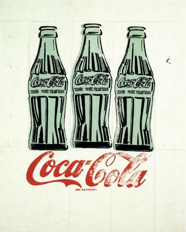
ANDY WARHOL (1928-1987)
‘Three Coke Bottles’, 1962 ( silkscreen, ink, and graphite on linen)
Warhol saw this aesthetic of mass-production as a reflection of contemporary American culture: "What's great about this country is that America started the tradition where the richest consumers buy essentially the same things as the poorest. You can be watching TV and see Coca Cola, and you know that the President drinks Coca Cola, Liz Taylor drinks Coca Cola, and just think, you can drink Coca Cola, too. A coke is a coke and no amount of money can get you a better coke than the one the bum on the corner is drinking. All the cokes are the same and all the cokes are good. Liz Taylor knows it, the President knows it, the bum knows it, and you know it." The obvious irony of this statement is that the price of that Coke bottle hits the stratosphere as soon as Warhol signs it.
As Cubism stands on the shoulders of Cézanne, Warhol's art is dependant on Duchamp's 'readymades. He was really a Dadaist in spirit - an 'agent provocateur'. His many whimsical proclamations about art were deliberately enigmatic and contrary, avoiding clarification and forcing his audience to speculate on their meaning: "I'd prefer to remain a mystery. I never like to give my background and, anyway, I make it all up different every time I'm asked." Warhol's evasive attitude was a strategy, the result of which was self publicity. He cultivated his own image like a business model which was inseparable from his art. He said, "I started as a commercial artist, and I want to finish as a business artist. Being good in business is the most fascinating kind of art."
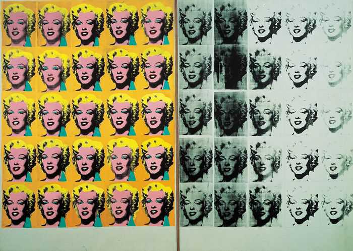
ANDY WARHOL (1928-1987)
‘Marilyn Diptych’, 1962 (silkscreen on canvas)
Warhol was against the idea of skill and craftsmanship as a way of expressing the artist's personality. He claimed to have removed both craftsmanship and personality from his own art: "The reason I'm painting this way is that I want to be a machine, and I feel that whatever I do and do machine-like is what I want to do.............If you want to know all about Andy Warhol, just look at the surface of my paintings and films and me, there I am. There's nothing behind it." His works were produced through the mechanical processes of film and silkscreen printing or made by others in his studio which was called 'The Factory'.
Warhol's paradoxical statements such as, "I am a deeply superficial person" or "art should be meaningful in the most shallow way" are echoed in his work. The left hand panel of his ‘Marilyn Diptych’ is a crudely colored photograph of the actress whose sense of 'self' is degraded through the repetition of her image, whereas the right hand panel is a physically degraded black and white image (as the printing ink runs out on the silkscreen) that reflects the ephemeral qualities of fame. Their combined panels are a memorable discourse on the nature of celebrity and its power to both create and destroy its acquaintances. The 'diptych' format was originally used in medieval painting for religious images of personal devotion, an appropriate choice considering Warhol's fascination for Marilyn Monroe. The work was exhibited in Warhol's first New York exhibition at the Stable Gallery in November 1962, just weeks after Marilyn's death from 'acute barbiturate poisoning'. The 'Marilyn Diptych', along with his other famous Marilyn paintings, is based on a 1953 publicity photograph for the film 'Niagara' that Warhol purchased only days after she died.
Roy Lichtenstein: Pop Art and the Comic Strip
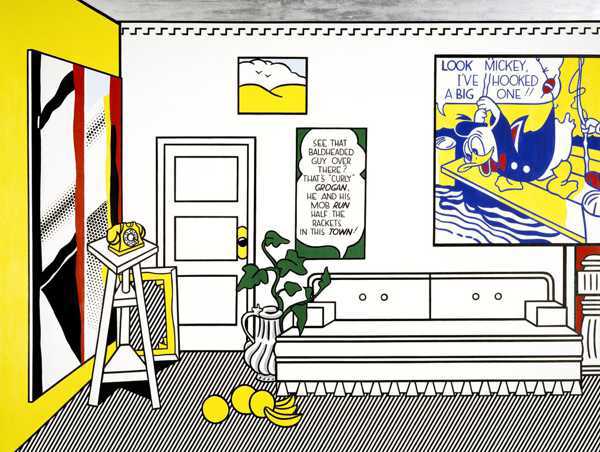
ROY LICHENSTEIN (1923-1997)
'The Artist's Studio No. 1 (Look Mickey)', 1973
(oil, acrylic resin and sand on canvas)
Roy Lichtenstein developed a pop art style that was based on the visual vernacular of mass-communication: the comic strip. It was a style that was fixed in its format: black outlines, bold colors and tones rendered by Benday dots (a method of printing tones in comic books from the 1950's and 60's). What actually changed through the development of Lichtenstein's art was his subject matter which evolved from comic strips to an exploration of modernist art styles: Cubism, Futurism, Art Deco, De Stijl, Surrealism and Abstract Expressionism.
Roy Lichtenstein's early work had a hint of Americana - "Expressionistic Cubism ....of cowboys and Indians" was how he put it - but it was still based on the painterly conventions that he had been taught to respect. Bored with the glut of Expressionist feeling that was around at the time, Lichtenstein attacked this sagging tradition with paintings like 'Look Mickey' (1961), a large scale cartoon image which "was done from a bubble gum wrapper" (a detail of this work can be seen in 'The Artist's Studio No.1', 1973). His comic strip images had an initial shock value, but like much of Pop they were quickly embraced by the galleries and collectors. Lichtenstein remarked, "It was hard to get a painting that was despicable enough so that no one would hang it.......everybody was hanging everything. It was almost acceptable to hang a dripping paint rag, everybody was accustomed to this. The one thing everyone hated was commercial art; apparently they didn't hate that enough, either."
The hard-edged commercial style of Lichtenstein's comic book paintings was an antidote to the incoherent splashes of late Abstract Expressionism, but it was not simply intended as an act of Pop/Dada protest, "I don't think that Pop would have existed without Dada having existed before it, but I don't really think that Pop is Dada. I don't think that I look on my work as being anti-art or anything that's different from the mainstream of painting since the Renaissance." Although there is an element of irony and humor in Lichtenstein's style, his work lies within the classical tradition of control in the use of line, shape, tone and color as compositional elements. The discipline of the work is cerebral with little left to impulse or emotion or what he calls 'the character of art'. "My work sanitizes it (emotion) but it is also symbolic of commercial art sanitizing human feelings. I think it can be read that way........People mistake the character of line for the character of art. But it’s really the position of line that’s important, or the position of anything, any contrast, not the character of it."
Lichtenstein does not exactly copy his comic book images; he subtly refines them, conscious of their transformed appearance on a larger scale and aware of their aesthetic interpretation within the context of the museum. (You can get an idea of this effect on David Barsalou's Lichtenstein Project.) As his style developed he move away from using the imagery of comics to interpreting modernist art styles, but still in his comic book vernacular. Lichtenstein was able to maintain this singular style for over thirty five years, not simply by varying his subject matter, but by viewing his art as an independent entity with an existence and development that he controlled, "I like to pretend that my art has nothing to do with me."
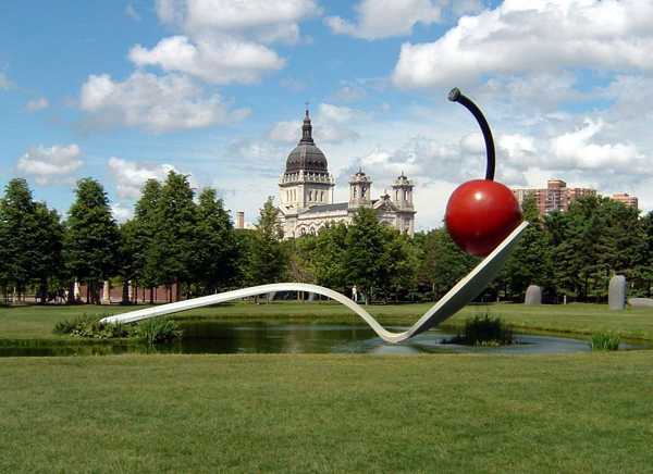
CLAES OLDENBURG (1922-), COOSJE VAN BRUGGEN (1942-2009)
‘Spoonbridge and Cherry’ photo: Mike Hicks, 1985-88
(aluminium, stainless steel and paint)
Claes Oldenburg was the Pop Artist who gravitated towards sculpture more than any of his contemporaries. At the start of 1960's he was involved in various 'Happenings': spontaneous, improvised, artistic events where the experience of the participants was more important than an end product - a kind of consumer art encounter for a consumer culture.
Oldenburg found his inspiration in the imagery of consumer merchandise, "I am for Kool-art, 7-UP art, Pepsi-art, Sunshine art, 39 cents art, 15 cents art, Vatronol Art, Dro-bomb art, Vam art, Menthol art, L & M art, Ex-lax art, Venida art, Heaven Hill art, Pamryl art, San-o-med art, Rx art, 9.99 art, Now art, New art, How art, Fire sale art, Last Chance art, Only art, Diamond art, Tomorrow art, Franks art, Ducks art, Meat-o-rama art." In 1961 he opened 'the Store' where he sold plaster replicas of fast foodstuff and junk merchandise whose crudely painted surfaces were an obvious parody of Abstract Expressionism. He used the front shop of 'The Store' as a gallery while he replenished his stock from his studio in the back shop.
Oldenburg's work is full of humorous irony and contradiction: on one hand he makes hard objects like a bathroom sink out soft sagging vinyl, while on the other he makes soft objects like a cheeseburger out of hard painted plaster. He also subverts the relative size of objects by taking small items like a spoon and cherry and recreating them on an architectural scale. He said, "I like to take a subject and deprive it of its function completely." By undermining the form, scale and function of an object, Oldenburg contradicts its meaning and forces the spectator to reassess its presence. When you see his large scale public works in their environmental settings, they have a powerful surrealist quality like Gulliver at Brobdingnag.
Pop Art Notes
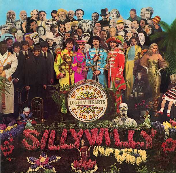
SIR PETER BLAKE (1932-)
'The Beatles - Sgt Pepper's Album Cover, 1967 (record sleeve)
Pop Art was a brash, young and fun art movement of the 1960's.
-
Pop Art coincided with the globalization of Pop Music and youth culture.
-
Pop Art included different styles of painting and sculpture but all had a common interest in mass-media, mass-production and mass-culture.
-
Although Pop Art started in Britain, it is essentially an American movement.
-
Pop art was strongly influence by the ideas of the Dada movement.
-
Pop Art in America was a reaction against Abstract Expressionism.
-
The art of Jasper Johns and Robert Rauschenberg is seen as a bridge between Abstract Expressionism and Pop Art.
-
The artist who personifies Pop Art more than any other is Andy Warhol.
-
Warhol's paintings of Marilyn Monroe are the most famous icons of Pop Art.
-
Roy Lichtenstein developed an instantly recognizable style of Pop Art inspired by the American comic strip.
-
Claes Oldenburg was the greatest sculptor of the Pop Art movement, creating many large scale public works.
