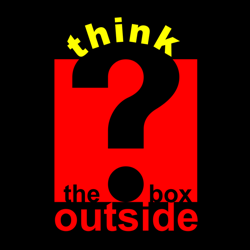
Graphic Design Lessons - The Art of Typography
This lesson teaches you about the elements of typography: the art of designing typefaces and fonts and the arrangement of printed type.
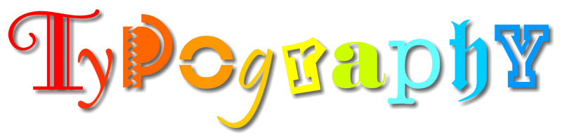
Typography is the art of designing and arranging printed type. It started as a craft in the 15th century with the invention of the printing press and has gradually evolved into an art form in its own right with modern digital technologies offering unprecedented creative possibilities.
In this lesson we examine the following elements of typography:
'Times New Roman' font
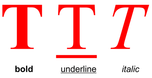
The terms 'Font' or 'Typeface' are commonly used to distinguish the various styles of letterforms in typography but their original meanings have merged and become interchangeable in contemporary usage.
The term 'Font' was originally used to identify the design elements in a typeface e.g. bold, underlined, or italic.
Bold type can add an emphasis or strength to a font.
Underlined type is an effective way of emphasizing the title of a document. It can also be used to call attention to an important section of text.
Italic type can also emphasise an important word or passage of text, but it tends to be used in a more informal context. Italic fonts have an animated style and are often selected for designs where there is a need to convey the illusion of speed and energy.
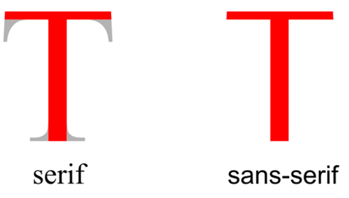
There are two main font types: serif and sans-serif.
Serifs are the extended corners at the ends of a letter and like all good design, they evolved naturally. They originated in the stone-carved letters of the Ancient Romans. Stone masons discovered that it was technically easier to finish chiseling the ends of a letter in a slow curve. Not only did serifs look more elegant but they were also very practical as they formed a natural channel for water or rain to flow away as it cleaned dust from the corners.
Serif fonts are the most legible and are commonly used for large blocks of text. Their wide horizontal baseline emphasizes the line of text for the eye and makes reading more comfortable.
Sans-serif fonts are simply fonts without serifs ('sans' means 'without' in French). They are also sometimes called Gothic fonts.
Typefaces
'Century' typeface
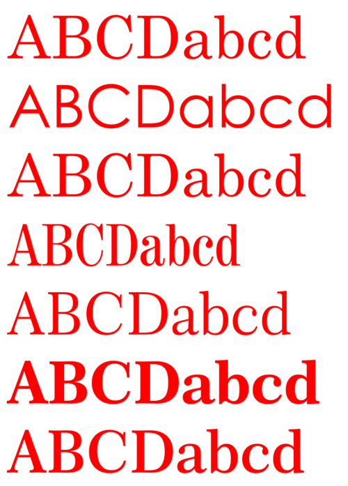
The term 'Typeface' was originally used to identify a family of fonts.
'Century' is a typeface. These fonts are all members of the 'Century' family. Their height is measured in points - the standard unit for printed text. There are about 72 points to one inch.
Although the fonts are all the same height, note how their width varies according to their style. Some fonts are more suited to fitting into a confined area of a design, while others like to spread themselves out.
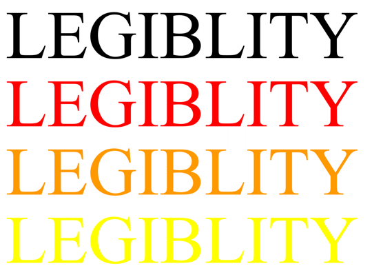
Legibility is the measure of how quickly a font can be read. The choice of color in relation to its background can have a strong effect on the legibility of a font.
The Legibility of a Font - Style
Fonts are usually selected for either their legibility or their stylistic effect. The balance between legibility and style is one of the important factors to be considered when choosing a font for a design.
Serif fonts like 'Times New Roman' (illustrated) are the easiest to read. They usually appeal more to an older target audience who are more concerned with content than style.

Novelty fonts like 'Carnivale' are fun but are less legible and inclined to date quickly. They tend to appeal more to a younger target audience who often prefer style over content.
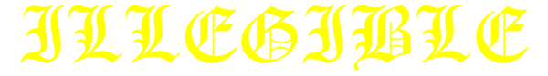
Calligraphic or script fonts like 'Old English Text', especially in capitals, are often the most illegible.

FONT: Times New Roman
Based on the carved letter forms on the buildings of Ancient Rome and used as the typeface of The Times newspaper today, the 'Times New Roman' font represents the voice of authority. This idea is reinforced here by its dark blue color - the color of law enforcement. 'Times New Roman' was designed in 1931 by British designers Stanley Morison and Victor Lardent. However, certain authorities now dispute this and believe it to be the work of the American designer, Starling Burgess.
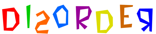
FONT: Bedrock
Various elements contribute to the sense of disorder in the 'Bedrock' font. The primitive shape of each letterform is chiseled to form a crooked design, while the irregular arrangement and different colors heighten the effect. Designed in 1995, it was probably inspired by 'The Flinstones' who lived in Bedrock, and it reflects the anarchy of a cartoon world.
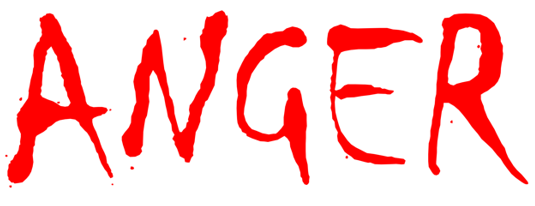
FONT: Chiller
Anger is expressed in the aggressive and calculatingly crude calligraphy of the 'Chiller' font. Its dangerous aura is amplified by the symbolic use of red - the color of rage. 'Chiller' was created by the British designer, Andrew Smith.

FONT: VAG Rounded BT
An ice cold blue color, smooth rounded corners and a long relaxing shadow, all contribute to the feeling of calm in the 'VAG Rounded BT' font. BT stands for Bitstream, the company from Cambridge MA, USA who designed the font.
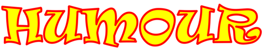
FONT: Ravie
A fun-filled font like 'Ravie' has a bouncy energy while bright primary colors enhance its cheerful form. 'Ravie' was designed by Ken O'Brien in 1993-94 at the Art Center in Pasadena, California.

FONT: Slipstream LET
The combination of italic type, graduated color and blurred form creates the illusion of speed using the 'Slipstream LET' font. Slipstream was designed by the Letraset Type Studio
FONT: Futura XBlk BT
By their nature bold fonts shout. 'Futura XBlk (extra black) BT' is a no nonsense, sans-serif font that gets its message across loud and clear. Paul Renner (1878-1956), a typographer associated with the Bauhaus in Germany designed the original Futura fonts. They were the most popular sans-serif fonts in the first half of the 20th century.
FONT: Broadway Engraved
Certain fonts inherit a reputation for style through their association with a particular time or place. 'Broadway Engraved' evokes the Art Deco era which was one of the most popular design movements of the early twentieth century. A metallic gold finish completes the stylish look. This font is a variation of 'Broadway' which was designed by Morris Fuller Benton between 1925-28.
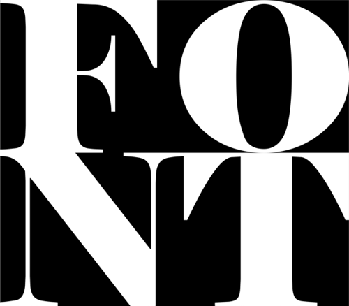
The interaction between the abstract elements of positive shape and negative space is an important consideration in the design of good typography
-
By positive shape we mean the shape of the letter itself.
-
By negative space we mean the background shapes between the letters.
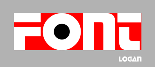
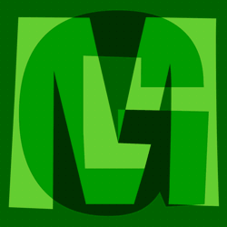
Equally balanced positive shapes and negative space interlock to create a strong architectural quality in the 'Logan' font.
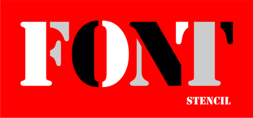
If you look closely you will see that a little trickery has been used to manipulate the positive shapes and negative space of this 'Stencil' font.
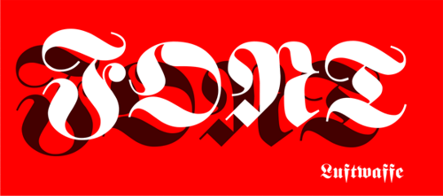
A careful balance between positive and negative elements was essential to create the rhythm and vitality of this script font. Script or calligraphic fonts, like 'Luftwaffe', should be avoided if you are looking for legibility.
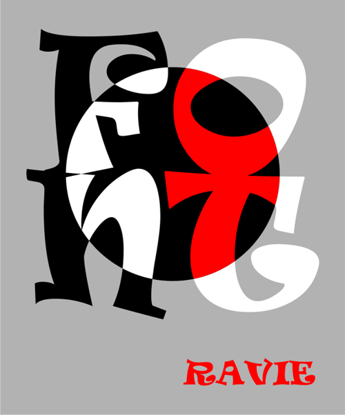
Ravie is a fun font for those who place stylistic effect over legibility. Although it looks improvised and intuitive, there is a calculated balance between its positive shapes and negative spaces. This effect is made more visible by the circle which highlights its animated and abstract qualities.
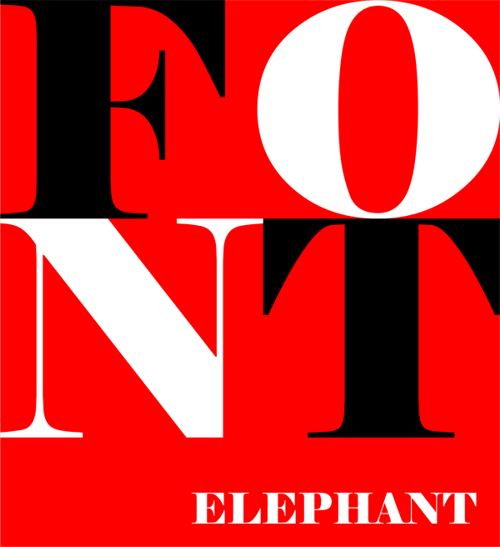
The elephant is a beast of burden and the 'Elephant' font reflects this quality. Like steel girders, its characters look to be able to support a great weight. The balance between the strength and delicacy of their positive and negative forms adds a sense of refinement to this typographic powerhouse.
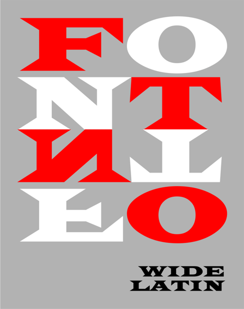
The interaction between the positive and negative shapes of the 'Wide Latin' font evokes the dynamic forms of minimalism in 20th century painting.