Graphic Design Lessons - A Graphic Design Workout
This lesson is a visual workout that is designed to increase your creativity in graphic design. Using a ready-made symbol as the main component of a design, you investigate its visual potential using the 3Cs of Graphic Design to generate a variety of ideas.
Graphic Designs are visual concepts with layers of meaning that communicate an idea to a target audience.
The aim of this lesson is to teach you how to generate ideas for your graphic designs. For this purpose, we use the 3 Cs of Graphic Design to raise your visual awareness of the graphic possibilities that lie within any shape or form.
The 3 Cs of Graphic Design: (Components + Composition = Concept)-
Components: These are the images and fonts we use to compose the layout of a design.
-
Composition: This is how we modify and organise the components of a design to communicate a message.
-
Concept: This is the style of the idea or message communicated by the arrangement of the components.
When you are trying to create ideas for a design project, the first ideas that you think of are not usually the most original. The reason they are already in your head is because you have seen them before in one form or another. The best ideas are those that you discover by trial and error through composing the components of your design to create a concept. This process is called The 3 Cs of Graphic Design.
Lesson Outline
In this lesson we challenge you to generate as many ideas as possible from a single symbol by testing its visual potential with the 3Cs of Graphic Design. The more ideas you can manage to develop from a single component, the more you can build up your stockpile of creative techniques to help you produce inventive solutions for your graphic designs.
Step 1: Components
-
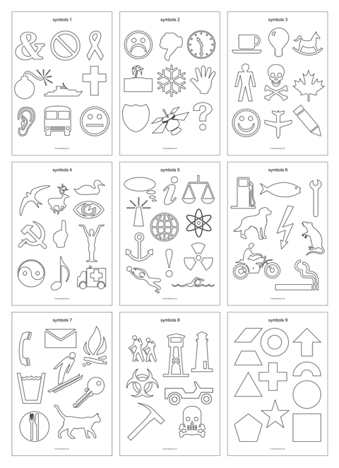
Start with one symbol selected from any of our component sheets which are free to download and print.
These symbols were chosen as components due to their simplicity as readymade designs.
Step 2: Composition
-
Modify your chosen symbol by applying a range of composition techniques to develop its shape, form, and visual appeal.
Our composition techniques illustrate the search for the creative possibilities that lie within a component. The techniques that we have demonstrated below are designed as springboards for your imagination, exploring different paths of development. You can use them as they are or combine/adapt them to suit your image and idea.
Step 3: Concepts
-
By selecting a component and running it through our various composition techniques you will learn how to generate a broad range of visual concepts.
When searching for the 'right' idea for a design you need to push the boundaries of your imagination by examining your components from as many angles as possible. Not every idea you develop pays off, but each adds to your general knowledge of design and becomes part of the bank of ideas that you may draw upon for future projects.
Graphic Design Composition Techniques - Choosing your Component

"It is not the answer that enlightens, but the question".
Eugene Ionesco (1904-94)
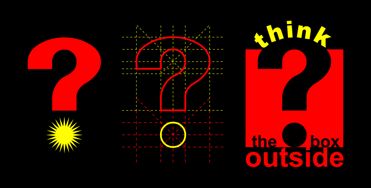
The symbol we selected from our component sheets is a question mark.
Note: When any designer starts a project there are always certain limitations imposed by the brief. In this lesson we ask you to impose color constraints on your work as too many options can overwhelm your creativity. With a more restricted path to follow you can see the creative possibilities of your component with fewer diversions. For this reason, we suggest that you limit the colors of the component and its background to three basic hues. In our demonstration examples we have limited the colors we use to black, yellow, and red.
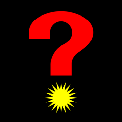
Graphic Design Composition Techniques - A Spark of Inspiration
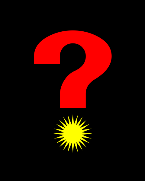
A spark of inspiration is often ignited by exploring the 3Cs of Graphic Design.
You must try to understand the possibilities that exist in any image you use. By making a simple modification to our question mark, the dot is transformed into a radiant star, suggesting the illuminating flash of a bright idea.
Graphic Design Composition Techniques - A Flash of Creativity
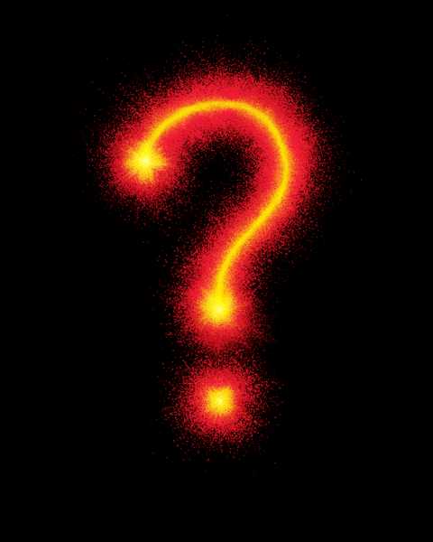
By asking a question you discover what you don't yet know. It directs your investigation of the subject.
Don't be satisfied with your first idea and keep pushing the boundaries of your imagination. Creativity has to be worked at. The first step is often made by evaluating the previous idea. To carry the 'illuminating flash' metaphor a step further, the pyrotechnics of this development adds a more volatile element to the design.
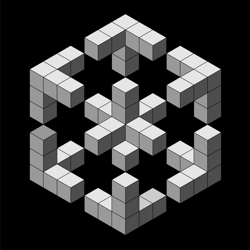
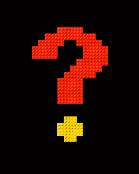
Graphic Design Composition Techniques - Modular Design
![]()
A modular design uses interchangeable components that combine within a framework to form a whole.
A pixelated image, where the whole is built up from individual units, is a good example of modular design. Pixelated imagery is associated with the infancy of computer graphics when processors could only handle low resolution images, but it is now used in a playful way to convey the retro look of early video games and the nostalgia that surrounds that genre. In our example we mapped out the shape of the question mark on a grid to replicate the effect of pixels. Then we replaced the pixelated squares with LEGO® building blocks to shift the concept of the image. Any image or medium (collage, cross-stitch embroidery, mosaic tiles, led lights) that can be configured on a square grid could be used for this example.
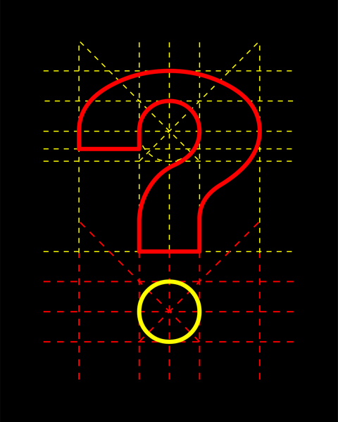
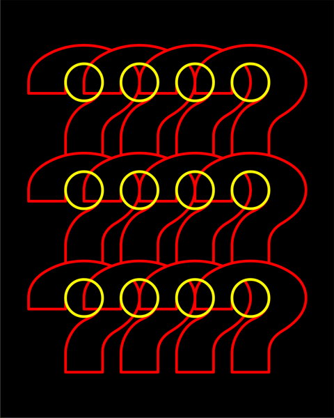
A technical drawing reveals the hidden construction of its subject by showing the proportions, tensions, and balances that lie within its form.
The adoption of a technical approach hints that the subject may possess the qualities associated with that visual style: accuracy, practicality, comprehensibility, functionality, intelligence, and discipline. In this example we analysed the composition of the shapes that form the question mark, revealing their hidden structure on a background grid.
Graphic Design Composition Techniques - Outlines
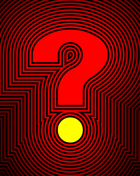
An outline defines a shape, but it can also be a form of emphasis.
The intense contrast of black and red outlines highlight the shape of the symbol, while their diminishing tones fade like an echo of its form to fill the background.
Graphic Design Composition Techniques - Stencilling
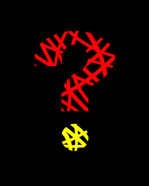

A stencil is a template with a cut-out design made from a thin sheet of paper or card. It is used to create an image by drawing or painting through the gaps.
This image was created by painting lines across the gaps until we achieved the desired effect. Stencilling accommodates the use of different forms of mark making including spraying, sponging, scribbling, and painting with a brush, palette knife or roller.
Graphic Design Composition Techniques - Masking
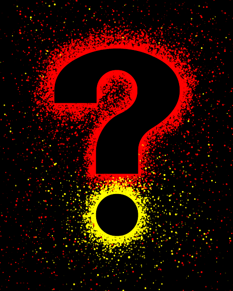

Masking is a similar technique to stencilling. A mask is a cut-out shape that is used to screen an image, allowing you to apply pigment to its surrounding area.
This image was created by spraying colors over a mask which was then removed to reveal its form. Masking and stencilling are ancient forms of image making dating back to the cave paintings of prehistoric times, yet they are still in use today as one of the principle techniques in digital art where they are called 'selections'.
Graphic Design Composition Techniques - Registration
One advantage of using a mask or stencil is that it may be reused, a feature that invites you to experiment with its creative potential.
To form this image, a mask was used three times, with the registration of each color slightly offset from the previous one. This effect introduces an element of movement into our theme.
Graphic Design Composition Techniques - Brushwork
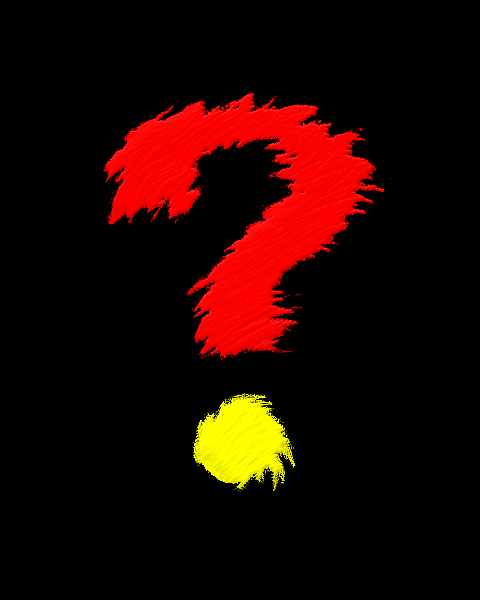
The natural energy of your brushstrokes can be harnessed to suggest movement.
In this example our question mark is painted with jagged brushstrokes whose sawtooth edge grips the surrounding space locking the symbol to its background.
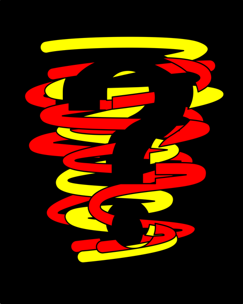
Graphic Design Composition Techniques - Natural Forces
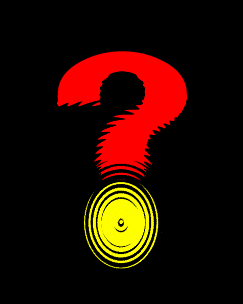
Natural forces such as ripples, fractures, twists, stretches, and compressions are interactions that may be applied to influence a shape or form in a particular way.
In this image, ripples centred on the dot expand into the question mark steadily distorting its form until they progressively weaken and fade away.
Graphic Design Composition Techniques - Motion
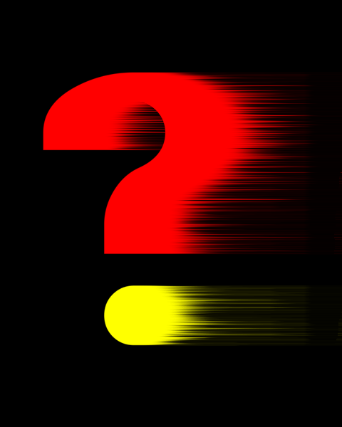
Movement is often inspired by photographic techniques.
This example uses the photographic technique of 'motion blur' to suggest movement. When photographing a fast-moving object, the resulting image is often blurred with a visual slipstream that indicates the direction of its movement. This phenomenon is commonly used in art and design to convey the idea of motion in a static image.
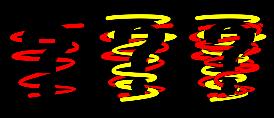
Graphic Design Composition Techniques - Rotation
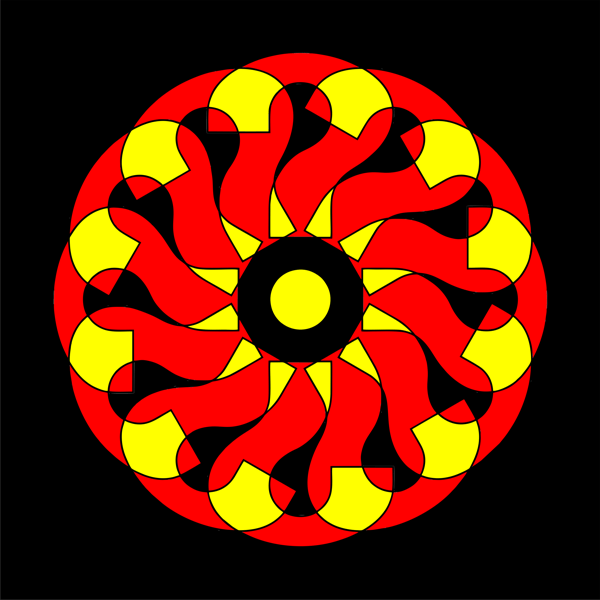
Rotating an image around a point is another way to suggest movement in your designs.
Here the question mark is rotated around its dot at 30-degree increments to create a kaleidoscopic effect. There is a counterchange of red and yellow in the overlapping areas to suggest the transparent glass patterns associated with this optical device.
Graphic Design Composition Techniques - Progression
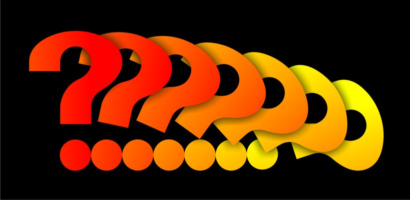
Progressions of position, color, tone and shape provide another method of introducing movement to a static image.
In this example, the question mark, which is centred on its dot, rotates through 90 degrees to create a 'flick book' style animation sequence. This movement is then enhanced by the progressive color change from red to yellow.
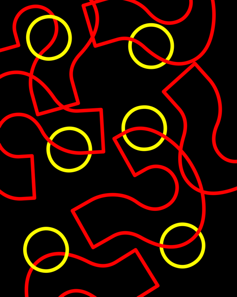
Graphic Design Composition Techniques - Distortion
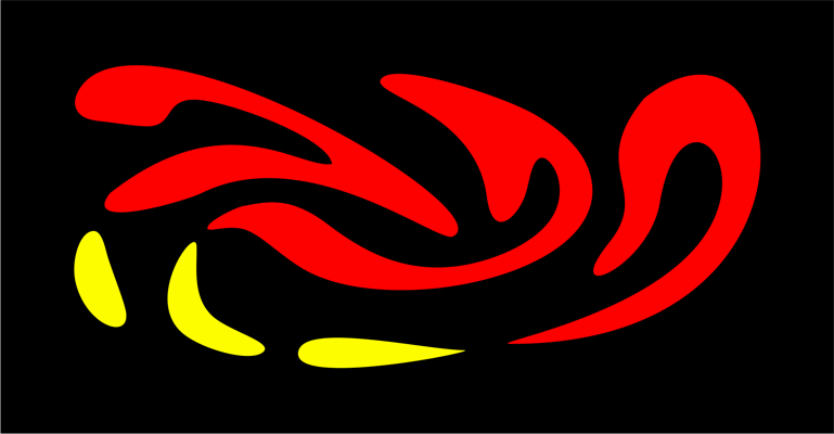
Distortion is changing the shape or structure of the image for aesthetic effect.
In this design we have stretched and bent three question marks into abstract forms that conduct a visual conversation between their positive shapes and the negative space that surrounds them.
Graphic Design Composition Techniques - Deconstruction and Reconstruction
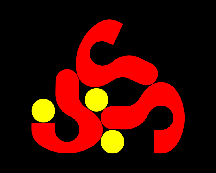
Deconstruct an image from its basic parts and then reconstruct its shapes into a new design.
Here we have separated the component parts of three question marks and rebalanced them within an asymmetrical design. This bold style, which exploits the dynamics of positive and negative shapes, has its roots in the abstract art movements of the early 20th century.
Graphic Design Composition Techniques - Regular Pattern
Regular or repeat patterns can be created from almost any shape. You just need to study the structure of your component to find elements that would link well in a design.
In this design we saw the possibility of linking the question mark dot to the interior curve of its shape, both of which share the same circular framework (see the Technical Drawing technique). Once you find a suitable link, the design completes itself.
Graphic Design Composition Techniques - Irregular Pattern
An irregular pattern can be created from any shape.
Good irregular patterns may look accidental but they are usually the result of conscious arrangements where the designer takes care to balance the elements of the image in an asymmetrical manner.
Graphic Design Composition Techniques - Pattern Fill
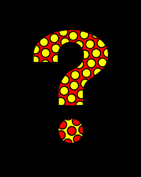
Any shape may be filled with any type of pattern to enhance its form.
Here we use a pattern of polka dots with a counterchange of colors to decorate our question mark. Patterns may be natural or man-made, regular or irregular, organic or geometric, structural or decorative, positive or negative, repeating or random, abstract or representational.
Graphic Design Composition Techniques - Image Fill
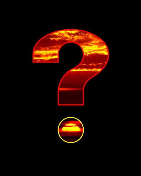
Images are often used to fill a shape and transform its appearance.
If you choose to use an image fill, select one that relates to the shape or meaning of the image. In our example we have related the sunset to the shape of the question mark where its dot naturally frames the setting sun.
Graphic Design Composition Techniques - 3D Forms

A shift from two to three dimensions takes an idea in a different direction and opens the door to the realm of illusion.
An understanding of perspective drawing is helpful for sketching 3D forms, but there are many free software programs that allow you to create accurate 3D models with ease.
Graphic Design Composition Techniques - A Fusion of Forms

Welding is technique used to join separate forms together.
'Welding' in graphic design is when you take two or more images and combine them to create a single form. Due to their two-fold nature, 'welded' images often suggest conceptual ideas with layers of meaning. In this example, one question mark is flipped and 'welded' to another to create the symbolic path from sorrow to joy.
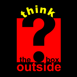
Graphic Design Composition Techniques - Positive and Negative Shapes
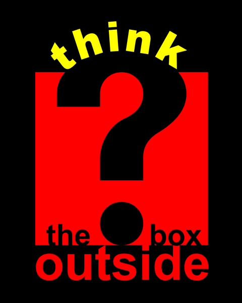
An awareness of how to manipulate the positive and negative shapes is a key skill in graphic design.
Our example above illustrates a technique called 'clipping', where one shape (a square) is used to 'clip' another (the question mark). This is a method of merging two shapes to create a single shape, one part of which becomes negative (the question mark) and the other positive (the square). Designers also use this technique to combine and simplify shapes into a single form as one image has more impact and is easier to remember than two.
In our design the text is broken up into positive and negative sections that link the visual and verbal communication of the image. Although, in Western society, we read from left to right and top to bottom, you can take the odd liberty with typography for graphic design purposes:
-
'think', which is a positive shape and the brightest color, forms the missing curve from the negative question mark and together they stress that part of the idea.
-
'outside' is placed physically outside the box to emphasise its meaning.
-
'the box' takes its natural position inside the box, but on a smaller scale. This helps with the order in which we read the message as we tend to read the brightest and largest words first.
All of our composition techniques are designed to kick start the development of your ideas. They can be modified and adapted to suit your own creative needs, leading to effective strategies of your own. Every designer needs their own stockpile of creative techniques as part of their brainstorming process at the start of any new project. The most constructive method of increasing that supply is discovered by following the 3 Cs of Graphic Design.