Painting a Cubist Still Life
This lesson demonstrates how to paint a Cubist Still Life that combines multiple viewpoints of the subject in a single image. Our step-by-step approach offers you guidance on the leap from realism to abstraction that we find in Cubist art. The lesson is divided into two sections: Part 1 focuses on drawing the shapes and structure of a Cubist still life; Part 2 deals with painting its arrangement of tone and color.

- Slide Show
- cubist-still-life-painting-8
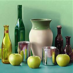
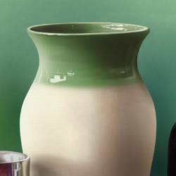
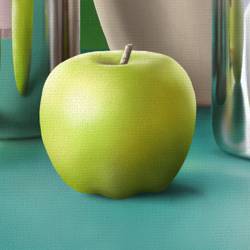
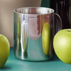
A Cubist Still Life
- cubist-still-life-drawing-1
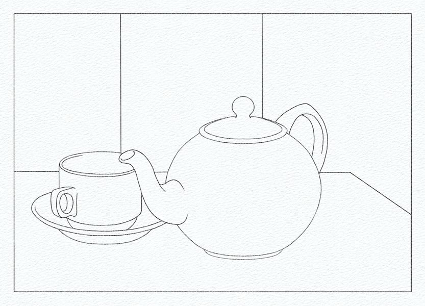
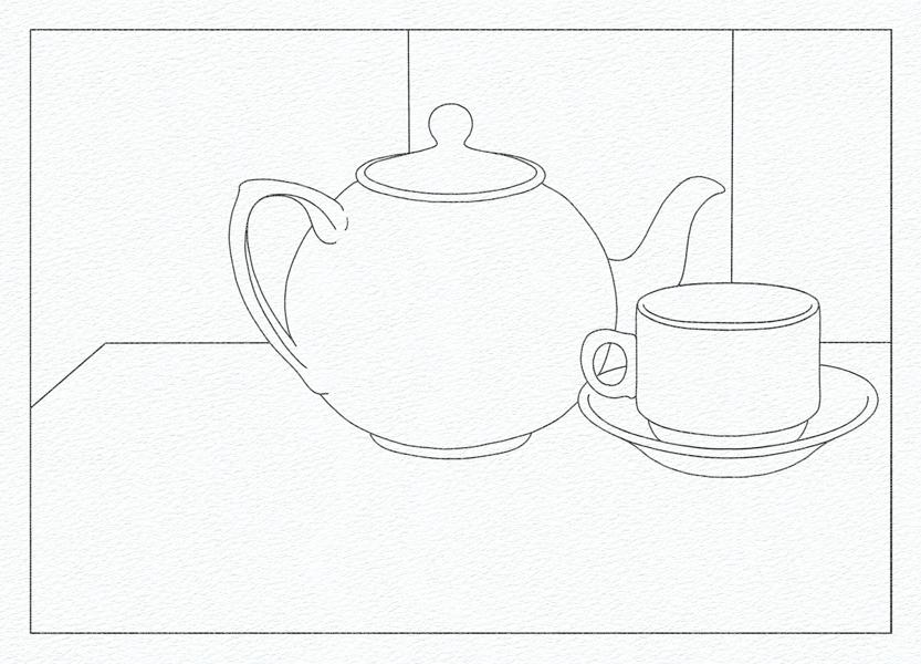
The First Viewpoint
- cubist-still-life-drawing-2
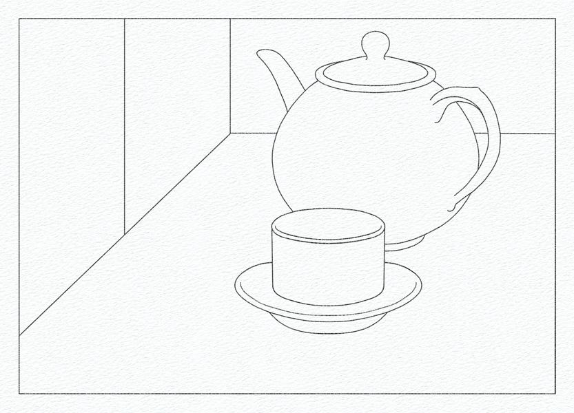
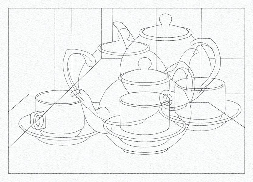
The Second Viewpoint
- cubist-still-life-drawing-3
The Third Viewpoint
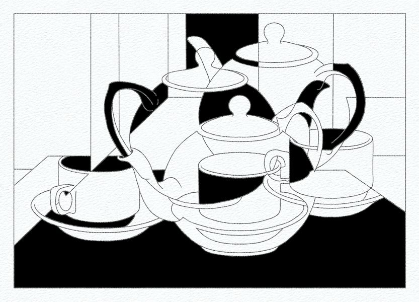
- cubist-still-life-drawing-4
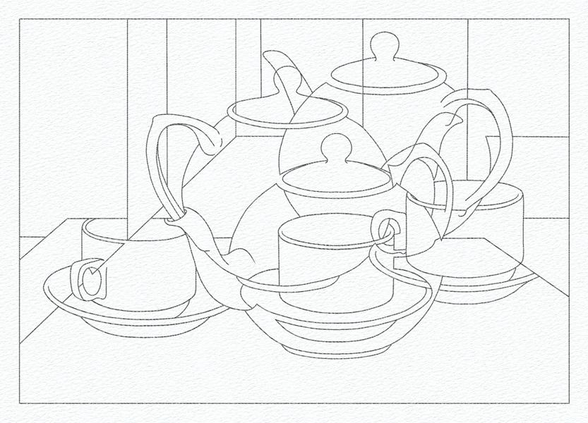
The Master Drawing
- cubist-still-life-drawing-5
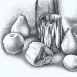
A Cubist Still Life Drawing
- cubist-still-life-painting-1
A Cubist Still Life Painting - Tonal Value 1
- cubist-still-life-painting-2
A Cubist Still Life Painting - Tonal Value 2
- cubist-still-life-painting-3
A Cubist Still Life Painting - Tonal Value 3
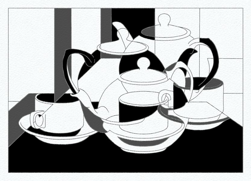
- cubist-still-life-painting-4
A Cubist Still Life Painting - Tonal Value 4
- cubist-still-life-painting-5
A Cubist Still Life Painting - Tonal Value 5
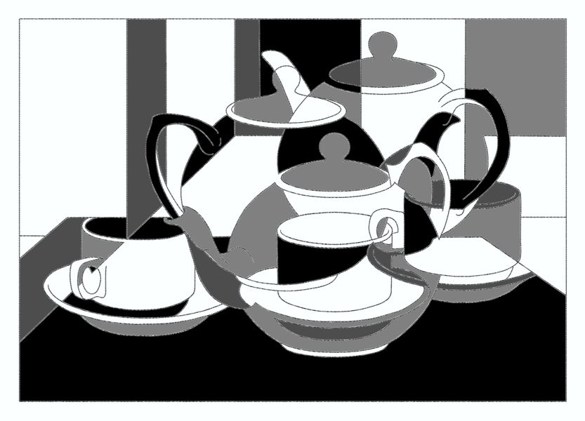
- cubist-still-life-painting-6
A Cubist Still Life Painting - Outlining the Tones
- cubist-still-life-painting
A Cubist Still Life Painting - Subdued Color Values
- cubist-still-life-painting-7
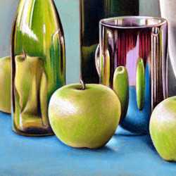
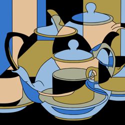
A Cubist Still Life Painting - Cool Color Values
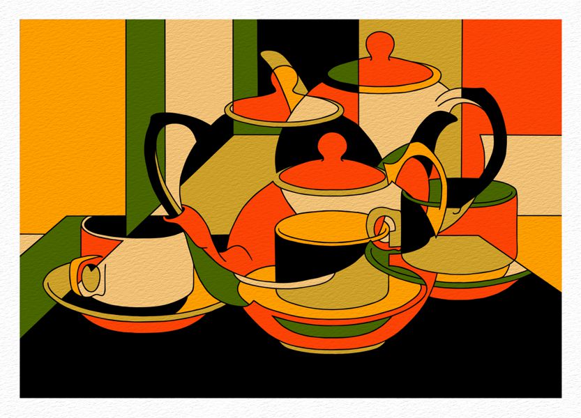
- cubist-still-life-painting-8
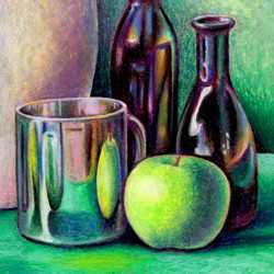
A Cubist Still Life Painting - Warm Color Values
While a traditional still life painting creates a naturalistic illusion of three-dimensional form, a Cubist still life flattens the illusion of depth in the image and focuses more on the abstract qualities of shape, tone, color, and pattern. The former sees painting as a snapshot of reality, observed from a fixed viewpoint; the latter sees it as an investigation of how we see the subject, observed from multiple viewpoints.
A Balanced Tonal Arrangement


The scale of tonal values used for our still life.
When painting the shapes of a Cubist still life, it is recommended that you create a balanced tonal arrangement first, and then replace those values with equivalent color values. This approach substantially reduces the countless color options open to you and gives you greater control over the rhythms and harmonies of your artwork.
-
A balanced tonal arrangement is the equal distribution of similar tones throughout the composition. This assists the artist to focus equally on all areas of the work, in contrast to the traditional use of a focal point that characterized painting before Cubism.
-
To construct a balanced tonal arrangement we created a scale of six tones graduating from black to white. These were distributed evenly throughout the painting, so that no matching tones sat next to one another, thereby ensuring a counterpoint of contrasts across the work.
A Cubist Still Life Painting - Tonal Value 1
We began the painting using our darkest black tone, establishing a 'foreground' base, and trying to balance the distribution of black shapes evenly across the work.
A Cubist Still Life Painting - Tonal Value 2
Next we applied the second darkest tone, again arranging its distribution evenly across the painting, ensuring that matching tones were kept apart.
A Cubist Still Life Painting - Tonal Value 3
The application of the next tone continues with the same method of arrangement as before.
A Cubist Still Life Painting - Tonal Value 4
With the successive application of lighter tones, the painting starts to develop a counterpoint between the rhythm of the surface pattern and its tonal depth.
A Cubist Still Life Painting - Tonal Value 5
Finally, the last shade of grey was painted, leaving the white of the paper as the brightest tone of the painting. Again, their arrangement was carefully balanced to ensure an even distribution across the image and avoid matching tones sitting side by side.
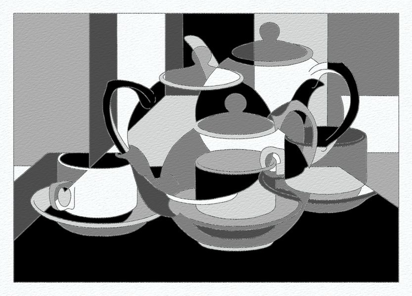
A Cubist Still Life Painting - Outlining the Tones
To complete our tonal study, a fine black line was painted to tidy up the edges of the shapes and emphasise the drawing.
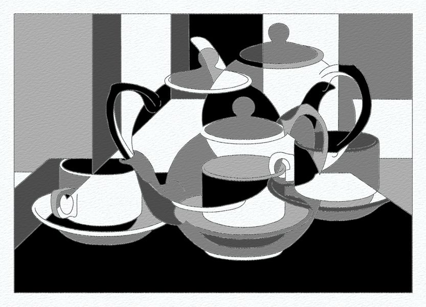
A Cubist Still Life Painting - Subdued Color Values
The reason we develop a tonal study first is to help us maintain an organized composition when we come to use color. The tonal arrangement determines the rhythmic layout of shapes on the surface of the painting, and establishes the harmonic layers of depth that lie within. Once these elements are fixed, their translation into corresponding colors becomes easier as a reference for their tonal value already exists.
-
In this version we have applied subdued tones of warm and cool greys. This was a common colour palette in early Cubism, where the innovative form of the image took precedence over the emotional impact of stronger colors.
-
Note that the black shapes and outlines have been left unaltered as they provide a strong framework on which to 'hang' any color palette.
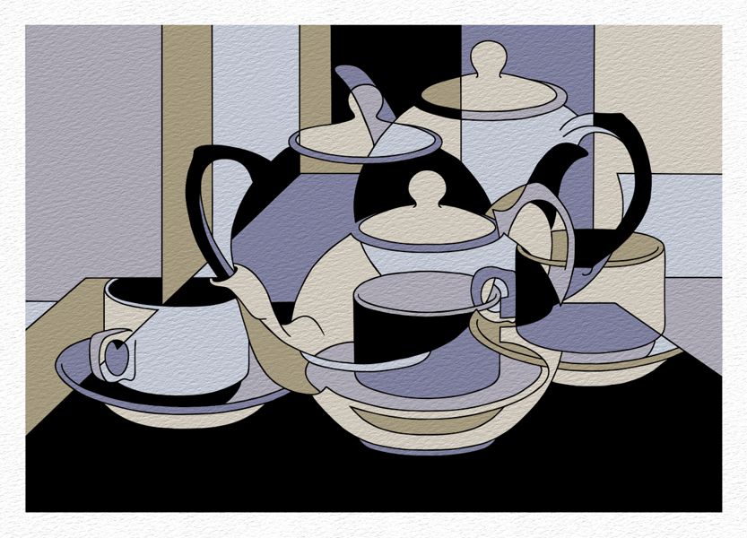
A Cubist Still Life Painting - Cool Color Values
In this arrangement the intensity of colors are increased, although they still roughly correspond to the tonal values in our earlier study. This arrangement uses mostly cool blues which are gently warmed by some soft ochres.
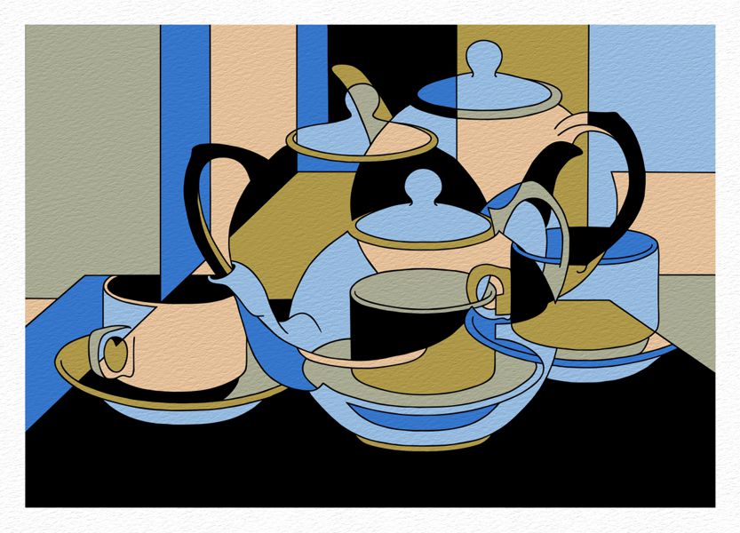
A Cubist Still Life Painting - Warm Color Values
This final arrangement uses warm colors that gradually intensify to a burning red, which is both enhanced and moderated by the complementary greens.
-
Note once more that the structural strength of the black shapes and outlines, like the leadwork in a stained glass window, is capable of holding the boldest color palette together without blowing the composition apart.


